Design & Lifestyle Blog

30 Dec ’11

From A Designer’s Journal: To A New Year, To 2012, And What I learned from 2011…

cheers

I am not the type of person who would write goodbyes or go all dramatic at anything. 2011 was a great year on many levels and as every year passes I try to learn and appreciate whatever I encountered whether good or less good. Many won’t agree that 2011 was actually good , it’s true to some extent if you want to count the natural disasters, the unnatural uprisings, the political surprises, the fall of regimes, the rise of others,and most of all people’s fear of the upcoming. This end of the year seems be the most perplexing in the new age so far, especially that nothing is hidden anymore, every slap is going viral, those who were once ruling the unfairly are now somehow losing control, with their secrets out in the public almost instantly.

On a personal note, this year I learned to appreciate the little things in life, thank God I didn’t go through any traumatic experience to reach that point, I just learned to contemplate and enjoy the blessings, I am guessing this comes along as we mature and grow.

In 2011 I met people from all walks of life, many were face to face contacts and others through social media. Twitter was my best companion on most of my days, I met new people almost daily, interacted with persons from different backgrounds and beliefs, learned from them and taught them as well. I was able to aid many who requested my help, and received help whenever I needed and almost instantly. In 2011 I grew fond of Instagram and realized how much I loved photography, I never knew sharing experiences through live photos would be so amusing and eye opening. On a personal level I was able to bond with my family more, I learned to organize my time in a manner where I can take care of myself, my family, and my career all at a comfortable pace and guilt-free, any mom would know how difficult that is to achieve! In 2011 I learned to see only the good in people, and always wake up with a smile because the day will smile back at me when I do. In 2011 I learned that I should take care of my health and teach everyone I know to do the same. I learned to accept new information and pass it on at every chance. In 2011 I learned that being fair relieves your conscience every time. In 2011 I practiced being in other people’s shoes at every situation, it makes accepting daily hassles much easier. In 2011 I learned that being honest is always the best policy, and that being professional with my clients does not mean we can not be good friends, on the contrary, it raises a sense of trust and reliability which gives me more reasons to be creative and design responsibly respecting their concerns and expectations.

In 2011 I am grateful for the success of my blog which allowed me to share all the beautiful things I come across or experience, this in turn created an opportunity to spread beauty as much as possible and train our eyes to  good proportions and understand the importance of good design in shaping our thoughts and lives.

In 2011, I am grateful for you, the readers, for interacting and enjoying the posts, I look forward to a more wonderful 2012 and nothing less. Hopefully with God’s blessings, our hard work, and persistence, we can get through another great year, thank you again, and have a great and beautiful 2012!
Image credit

29 Dec ’11

Dream Home On A Volcanic Island | Residential Design

a49d079a

One of the reasons I fell in love with this house is not just the bold design and the wonderfully hidden spaces that can be utilized while overlooking the breathtaking island, it’s the fact that there is a story behind the construction of this house which lasted almost a decade. According to the NYTimes,  Pedro Correia and his wife, Graça who live on the largest of nine volcanic islands in the Azorean archipelago. They decided after the family started growing to build their 3,767-square-foot dream house and commissioned their architect friend Bernardo Rodrigues  founder of Bernardo Rodrigues Arquitecto in Porto, Portugal.


dbd03b90

The project was slowed by both a lengthy delay in receiving materials from Lisbon and the paucity of skilled laborers on the island. It took one year to build and assemble the steel framing for the doors and windows, and another two years to pour concrete and install flooring and finishes in the home. The exterior walls were painted Siena red and pewter. Inside, the walls were given hues of either chestnut brown or olive green. The total cost of construction was just over $500,000. Mr. Correia and wife and two daughters, Maria, 13, and MaFalda, 9, moved into the three-bedroom, two story home in early 2010.

Mrs. Correia said their dream home was more challenging and expensive than they had expected. But as she put it, “that’s the price you pay to have the best home.”

Check the beautiful photos of this project below.

89915071


(more…)

27 Dec ’11

Could This Mansion Be Ashton Kutcher’s Next Home?

Retractable-glass-walls-665x406

According to Home Designing, this could be Ashton Kutcher’s next House. The 9,385 square foot mansion is priced at $10,800,000 located in the Hollywood Hills with spectacular views of Lake Hollywood and the culturally iconic sign, visible beyond walls of retractable glass.

glass-floor-665x435

The contemporary five bedroom dream home boasts eight bathrooms, a ‘floating’ dining room, state-of-the-art screening room, and a fitness & massage room. The house also makes full use of the Hollywood heat, enjoying an infinity-edged swimming pool with elevated spa, and a number of outdoor rooms perched on cantilevered decks or far reaching patios with extensive built in fire pits.

Hollywood-Hills-mansion-665x405

open-plan-living-room-665x459

(more…)

Basic Steps To Design Your Space On AOK

AOK

I had the honor to guest post on AOK and list tips on how to design your space. Listed are tips and examples of what can be done to solve problems and enhance the look of any room.

For Full Post check AOK.

26 Dec ’11

Graham & Brown Introduce The Whispers Wallpaper Collection By Marcel Wanders

Graham&Brown_Forest_Muses-LR


Powerful, mysterious and seductive black is universally prized. Embraced by both kings and monks, it is in turn melancholy’s confidant and glamour defined.

Whispers, the new wallpaper collection by Marcel Wanders celebrates polarity and the art of observation.Like little secrets, soft velvet whispers sparkle upon rough textured paper offering multiple yet opposing sensations to the touch and eye. The colors are dark, the details enigmatic, only upon close inspection do the narratives come to life. This is a wallpaper for intimate spaces such as a boudoir or a private bar, and within these spaces Whispers invites you to live your wildest dreams. Your secrets are safe. Black absorbs all.Tell me a secret… whisper something… no one else knows…

fc279119-a0ff-4129-81a8-17989f8cc1bb

I love this collection by Marcel Wanders and feel it is fairly priced considering the quality and designs, at $160 per roll, each roll is 52cm wide and 10 meters long.The collection is of 4 designs with varying colors.

Graham&Brown_Rose_bed-LR

(more…)

24 Dec ’11

Merry Christmas Beautiful People….

Filed under: From a Designer's Journal — Tags: , — Sahar @ 8:42 pm

photo

Card made via Red Stamp iPhone Application.

18 Dec ’11

Bocci Introduces Colors To Its 28 Series Collection | Lighting Design

Bocci-28-2

Bocci has introduced a huge range of color in its 28 series collection. Creative Director Omer Arbel’s intent behind 28 was to design a system that produces form, rather than designing form itself. A magnificent success, the pendants are designed to cluster in hexagonal shapes, which nestle into one another. Adding color introduces a grand range of infinite possibilities, from clustering by similar hues to creating amazing multicolor installations.Thus, every 28 series pendant made is formally different from any other in existence.

Bocci-28-3

Bocci-28-7

Bocci-28-12

(more…)

17 Dec ’11

A-Cero Designs Residence In Adma, Lebanon | Architecture

Filed under: Architecture,blog — Tags: , , , , , — Sahar @ 12:14 am

73

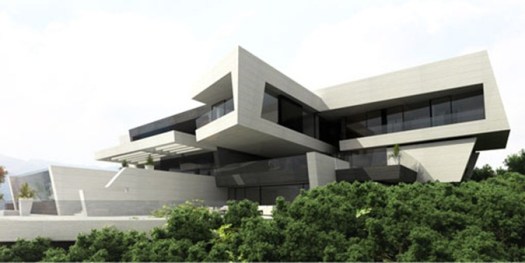
Finally one of my favorite architecture firms, A-cero,  makes it to Lebanon with this magnificent residence in Adma. This is a 3-level detached house situated in a unique environment on the side of a mountain overlooking the sea.

The basement is around of 546 m2,including a garage for 10 vehicles, 3 halls  multipurpose room, sauna,  3 bedrooms,and a kitchen.

The ground floor level is of 486m2 includes an office, a living room, a dining room, a  kitchen,a family living room in addition to porches and large terraces . There is also an outdoor pool and Jacuzzi.

The first floor is around 475m2 and includes the private areas such as the master bedroom suit , guest bedroom, and 3  bedrooms. Also there is a small garden on this level.


83


The materials used for the facade are the white and beige travertine stone with black glass. What is prominent is broken facade forms, coherent with the topography of the land’s stony steep slopes.The architecture highlights the cantilevered master bedroom with spectacular sea views and overlooking the hillside.

The pool is designed with a structural glass in the front to take the advantage of views and the surrounding.

Both the lounge and the dining room windows are retractable, creating a fusion of the exterior with the interior, enjoying the good weather of this region throughout the year

The overhangs favor the visual effect on surrounding vegetation. One of the formal characteristics of this single family house is the blind spot (the wall without windows), oriented toward the street, in contrast to the large windows of the house, facing the valley and the sea.

In the beach area you can enjoy unbeatable views, so A-cero designed a large porch area partially covered by folding arm awnings.

93


102

62

(more…)

Older Posts »

Powered by WordPress

Pin It on Pinterest