Pantone Reveals 2 Colors for 2016

pantone 2016


For the first time Pantone introduces two shades, Rose Quartz and Serenity as the PANTONE Color of the Year 2016. Rose Quartz is a persuasive yet gentle tone that conveys compassion and a sense of composure. Serenity is weightless and airy, like the expanse of the blue sky above us, bringing feelings of respite and relaxation even in turbulent times.

Whether in soft or hard surface material, the pairing of Rose Quartz and Serenity brings calm and relaxation. Appealing in all finishes, matte, metallic and glossy, the engaging combo joins easily with other mid-tones including greens and purples, rich browns, and all shades of yellow and pink. Add in silver or hot brights for more splash and sparkle.

COY2016-Palettes (1)


How will you use these colors in 2016?

Pantone Reveals Color of The Year 2014- Radiant Orchid


radiant_orchid_HomeSlider_Final

Every year around this time, Pantone announces the color of the year. This decision is based on extensive research in all related fields such as fashion, beauty, and design. This year the color is Radiant Orchid. I have to say I saw this coming in someway since I noticed at many furniture fairs brands were introducing similar hues to their lines such as Minotti & Baxter.

From Pantone:

“While the 2013 color of the year, PANTONE 17-5641 Emerald, served as a symbol of growth, renewal and prosperity, Radiant Orchid reaches across the color wheel to intrigue the eye and spark the imagination,” said Leatrice Eiseman, executive director of the Pantone Color Institute®. “An invitation to innovation, Radiant Orchid encourages expanded creativity and originality, which is increasingly valued in today’s society.”

“An enchanting harmony of fuchsia, purple and pink undertones, Radiant Orchid inspires confidence and emanates great joy, love and health. It is a captivating purple, one that draws you in with its beguiling charm.”

Gallery-Image-0

Continue reading “Pantone Reveals Color of The Year 2014- Radiant Orchid”

Pantone Reveals Color of The Year 2013 | Trends


pantone header


PANTONE 17-5641 Emerald, a lively, radiant, lush green, is the Color of the Year for 2013.

The 2012 color of the year, PANTONE 17-1463 Tangerine Tango, a spirited reddish orange, provided the energy boost we needed to recharge and move forward. Emerald, a vivid verdant green, enhances our sense of well-being further by inspiring insight as well as promoting balance and harmony.

Most often associated with brilliant, precious gemstones, the perception of Emerald is sophisticated and luxurious. Since antiquity, this luminous, magnificent hue has been the color of beauty and new life in many cultures and religions. Also the color of growth, renewal and prosperity, no other color conveys regeneration more than green. For centuries, many countries have chosen green to represent healing and unity.

“The most abundant hue in nature, the human eye sees more green than any other color in the spectrum,” said Leatrice Eiseman, executive director of the Pantone Color Institute®. “As it has throughout history, multifaceted Emerald continues to sparkle and fascinate. Symbolically, Emerald brings a sense of clarity, renewal and rejuvenation, which is so important in today’s complex world. This powerful and universally-appealing tone translates easily to both fashion and home interiors.”

Continue reading “Pantone Reveals Color of The Year 2013 | Trends”

Pantone Reveals The Top 10 Fashion Colors For Spring 2013


PANTONE has revealed its top 10 fashion colors for Spring 2013 with ‘Monaco Blue’ topping the list for spring 2013 and revealed as used by 13.2% of fashion designers including Herve Leger and Tommy Hilfiger.

According to PANTONE Color Institute’s executive director, Leatrice Eiseman, she describes Monaco Blue as a “wonderful, calming and anchoring color” to the rest of collection.

PANTONE’s remaining 9 colors are 'Dusk Blue’, ‘Emerald’, ‘Grayed Jade’, ‘Linen’, ‘Poppy Red’, ‘African Violet’, ‘Tender Shoots’, ‘Lemon Zest’ and ‘Nectarine’ shown below. As you notice the trend is towards calmer colors than what have seen in the past season.

Pantone Color Of The Year 2012: Tangerine Tango

tangerine

Every year at around this time, designers of all fields await the results for next year’s color of the year. Pantone announced that for 2012, Tangerine Tango, a lively and radiant orange, will be the color of the year 2012. “Sophisticated but at the same time dramatic and seductive, Tangerine Tango is an orange with a lot of depth to it,” said Leatrice Eiseman, executive director of the Pantone Color Institute®. “Reminiscent of the radiant shadings of a sunset, Tangerine Tango marries the vivaciousness and adrenaline rush of red with the friendliness and warmth of yellow, to form a high-visibility, magnetic hue that emanates heat and energy.”

4

Tangerine Tango for Interiors and More
”Energize interior spaces with Tangerine Tango patterned home accessories. Pillows, bedspreads and tabletop accessories in this high-impact hue add spice to any room. Or incorporate Tangerine Tango appliances and personal electronics for an unexpected pop of color. Looking for an inexpensive way to perk up your home? Paint a wall in Tangerine Tango for a dynamic burst of energy in the kitchen, entryway or hallway.”


1

About the PANTONE Color of the Year
The color of the year selection is a very thoughtful process. To arrive at the selection, Pantone quite literally combs the world looking for color influences. This can include the entertainment industry and films that are in production, traveling art collections, hot new artists, popular travel destinations and other socio-economic conditions. Influences may also stem from technology, availability of new textures and effects that impact color, and even upcoming sports events that capture worldwide attention.

For more than a decade, Pantone’s Color of the Year has influenced product development and purchasing decisions in multiple industries, including fashion, home and industrial design, as well as product packaging and graphic design. Past colors include:

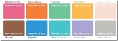
• PANTONE 18-2120 Honeysuckle (2011)
• PANTONE 15-5519 Turquoise (2010)
• PANTONE 14-0848 Mimosa (2009)
• PANTONE 18-3943 Blue Iris (2008)
• PANTONE 19-1557 Chili Pepper (2007)
• PANTONE 13-1106 Sand Dollar (2006)
• PANTONE 15-5217 Blue Turquoise (2005)
• PANTONE 17-1456 Tigerlily (2004)
• PANTONE 14-4811 Aqua Sky (2003)
• PANTONE 19-1664 True Red (2002)
• PANTONE 17-2031 Fuchsia Rose (2001)
• PANTONE 15-4020 Cerulean (2000)

Pantone
Latest Color Trends

Every season Pantone introduces the top 10 colors. All designers and consumers alike await this event as it will be prevalent around us for at least 6 months.Once a year however, there will be an announcement for the color of the year. The color of the year 2010 is Turquoise which explains why it is found in all seasonal palettes for 2010 in slightly varied hues.

As most fashion enthusiasts know, New York Fashion week started September 9,2010 and staying till September 16,2010. During this event Pantone released their Spring 2011 Fashion color report.

The Spring 2011 Pantone Fashion Color Report shows that Africa, India, Peru and Turkey are acting as inspirations for spring 2011.
“The colors designers have chosen for the spring season present an interesting marriage of unexpected warm and cool tones,” said Leatrice Eiseman, executive director of the Pantone Color Institute.

spring 2011
Spring 2011 Trends

The designers who worked on the selection took into consideration the economic situation and aimed at using colors that can be extended from season to season. So you will notice that you can add to your closet instead of create an entire new wardrobe.

Below are the colors for fall 2010, full reports and pamphlets are found on the original site.

fall10
Fall 2010 Trends
TheMustHaveColorTrendsForFall2010
Fall 2010 Must have color trends

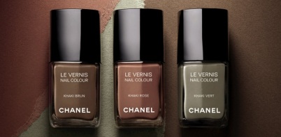
Chanel Limited editions- Khakis with a twist

Continue reading “Latest Color Trends”

Pin It on Pinterest