Design & Lifestyle Blog

13 Dec ’13

Instagram Offices in San Francisco | Interiors


Geremia Design designed the instagram headquarters in San Francisco based on their brand's image including retro elements such as furniture and cameras.

The space is well lit and very relaxing, but do you think it represents the brand well or could they have done something more? I liked the simplicity, accessories, and vintage camera collection the most.

(more…)

28 Oct ’12

Net-A-Porter Offices In London | Office Design

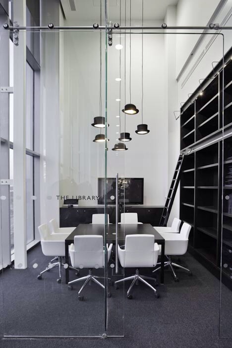
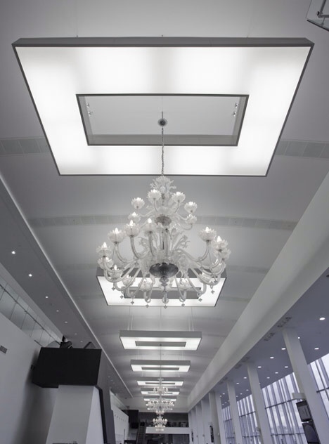
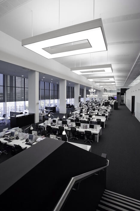
UK designers Studiofibre are the designers of London headquarters of the famous fashion etailer Net-A-Porter.

Monochromatic and very stylish just as the brands they sell, Net-A-Porter’s London offices are designed with high ceilings, beautiful and simple details, and an array of stylish elements. In addition to that, the design focuses on work productivity and efficiency through proper use of lighting and a well structured layout plan accommodating the staff and their circulation. Below are the details by the designers themselves.

5 Oct ’11

WikiLeaks Headquarters In Sweden | Office Design

284333226_08

According the Architect’s website, this office was constructed for an internet service provider 30 meters down under the granite rocks of the Vita Berg Park in Stockholm. Known as Pionen – White Mountain, the space was designed by Albert France-Lanord Architects,  with the concept of considering the rock as a living organism crawling into the actual workspace. After destruction of the former office and blowing up the rock to create extra space, they reinforced the cave, and made all the technical installations required for running the servers hosting their data. As you can see, not much “visual enhancements” were needed, the location itself just needed the lighting effects, in addition to what looks like an “operations” room, due to the sensitivity of the works of the famous WikiLeaks founder and team. It is without a doubt the best option for who was for a brief time, one of the world’s most powerful and wanted persons.


308906749_03


2090979068_01

1281416779_02


2071742019_09

1494548146_16

1979943388_12

1327798737_plans


1585881797_section-01


2055805689_section-02

2027794358_section-03


1684950789_07


Architects: Albert France-Lanord Architects
Location:Stockholm, Sweden
Program: Datacenter
Collaborators: Frida Öster and Jonatan Blomgren
Geology Consultant: Geosigma AB
Construction: Albert France-Lanord Architects
Client: Bahnhof AB
Construction Area: 1,200 sqm
Project year: 2008
Photographs: Åke E:son Lindman  

Source: ArchDaily

30 Aug ’11

Tribal DDB Office By i29 | Offices

1


i29 interior architects designed these offices for the advertising agency Tribal DDB Amsterdam. The space is around 650m2 and accommodate 80 members of staff.

Tribal DDB Amsterdam is a highly ranked digital marketing agency and part of DDB international, worldwide one of the largest advertising offices. i29 interior architects have gained numerous awards and nominations over the years for their distinct work especially in commercial spaces and offices.

The main features in this project are the neutral colors of white and grey and more importantly the use of felt material to encase almost everything. The use of this material aids in sound absorption and in hiding up scars caused by demolition. “ There is probably no other material which can be used on floors, ceiling, walls and to create pieces of furniture and lampshades than felt. It’s also durable, acoustic, fireproof and environment friendly. Which doesn’t mean it was easy to make all of these items in one material!”


5

3

5

4


From the designers:

The goal was to create an environment where creative interaction is supported and to achieve as much workplaces as possible in the new structure with flexible offices and large open spaces.

i29 searched for solutions to various problems which could be addressed by one grand gesture. At first a material which could be an alternative to the ceiling system, but also to cover and integrate structural parts. Acoustics became a very important item, as the open spaces for stimulating creative interaction and optimal usage of space where required. This led us to the use of fabrics. It is perfect for absorbing sound and therefore it creates privacy in an open space. From felt we made ceiling, walls, furniture and lamps.
2 Jun ’11

Heineken New York Headquarters | Office Design


This has to be one of the most inspiring spaces I have seen. TSC Design worked on Heineken’s 38,000-square-foot office space in New York making use of elements and colors that serve as a branding locale as well. The elevator lobby is one of the most catchy spaces using the green glass Heineken bottles that are illuminated to give such a beautiful effect.

The other color they used was the red which is also part of their brands logo. The red was used in popping elements such as reception Arne Jacobsen  chairs and in the desk partitions and employee chairs as shown in photos below.


(more…)

24 Mar ’11

Leo Burnett Offices Australia | Office Design

Filed under: Interiors — Tags: , , , — Sahar @ 6:00 pm

Leo Burnett, the advertising agency behind Marlboro man , Pillsburry doughboy, and  Green Giant, commissioned Hassel, a design company in Australia to come up with their Sydney office design. The “unfinished” look is the main part of their concept.

(more…)

10 Feb ’11

Google London Offices Phase 1 | Office Design

Filed under: Interiors — Tags: , , , — Sahar @ 3:45 pm

Architecture firm Scott Brownrigg have completed phase 1 of the 40,000 sq ft London office of internet search engine Google, with a giant logo in the lobby forming doorways through the two Os. Designed with a Brighton beach theme, the interior is filled with dodgem cars used as work spaces, red telephone booths, beach huts and giant dice. Wallpaper in the meeting rooms and video conference booths is printed with seaside imagery.The space also includes a gym, spa center and restaurant offering free meals for the 300 strong staff.

As with many other Google offices worldwide, the office has a strong local theme. Joe Borrett and Jane Preston from Google, working with the Scott Brownrigg Interior Design team chose a theme of London-Brighton and as a result many iconic elements of both are incorporated into the office design.

Brightly colored timber beach huts are meeting rooms and giant colorful dice accommodate individual video conference booths, original dodgem cars and traditional red telephone booths are all work spaces available to staff and visitors.

(more…)

Powered by WordPress

Pin It on Pinterest