This project in particular has sentimental value to me. The Ghazale Residence is three-story villa which is a collaborative work between architect Gilbert Zarka and myself, Sahar Ghazale.
Located in Chtoura, in the beautiful Bekaa Valley in Lebanon, this residence stands out in terms of design. It is the only such architecture in the area, as opposed to the traditional designs surrounding it.

On the exterior facades, we used Basalt stone in both white and grey, and Béton brut (architectural concrete). You will notice several volumetric elements such as concrete pergolas, a 13m high chimney and high glass structures allowing as much light as possible into the house. One of the main features of the garden is the shallow pool with fountains and teak wood pergolas.

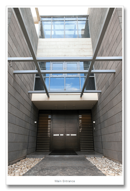
In more than one area there are double height voids and skylights. Even the basement enjoys natural sunlight through a garden continuing from the exterior to the interior. The main entrance boasts a long runway of stamped concrete in two different grey tones with contracting white sea stones flanking from both sides leading to a 3meter high solid walnut main door.

The owner is a person who loves his garden and cherishes every single plant, thus requested numerous water features and a beautiful olive tree he raised on a separate hill. Palm trees which are usually synonymous with humid and hot areas such as the gulf, composed a large portion of the plantation in the garden of this villa, something which is unusual for this specific location.


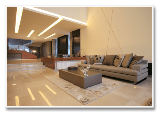
The interior design is a continuation of the exterior. The basalt stone continues to the inside on numerous walls. A red wall supports the main staircase. Apart from that all finishes are in neutral tones indicating luxury and simplicity. Wood used on the ground level is Palisander which contrasts beautifully with the dark tinted walnut doors. All doors were in the form of panels reaching ceiling height.

Most of the furniture used was from Roche Bobois, which is the owner’s favorite brand. Ceiling design is very simple. Lighting is mainly in the form of indirect lighting, halogen spotlights highlighted certain areas for warmer color effect. In future posts I will be introducing more interior photos of the different rooms on the upper floors.


For further information you can contact me directly on my contact page or email.

