Design & Lifestyle Blog

16 Mar ’19

HOMI Milano January 2019 | Events and Exhibitions

Filed under: Exhibitions & Events — Tags: , , , , , , — Sahar @ 12:55 am


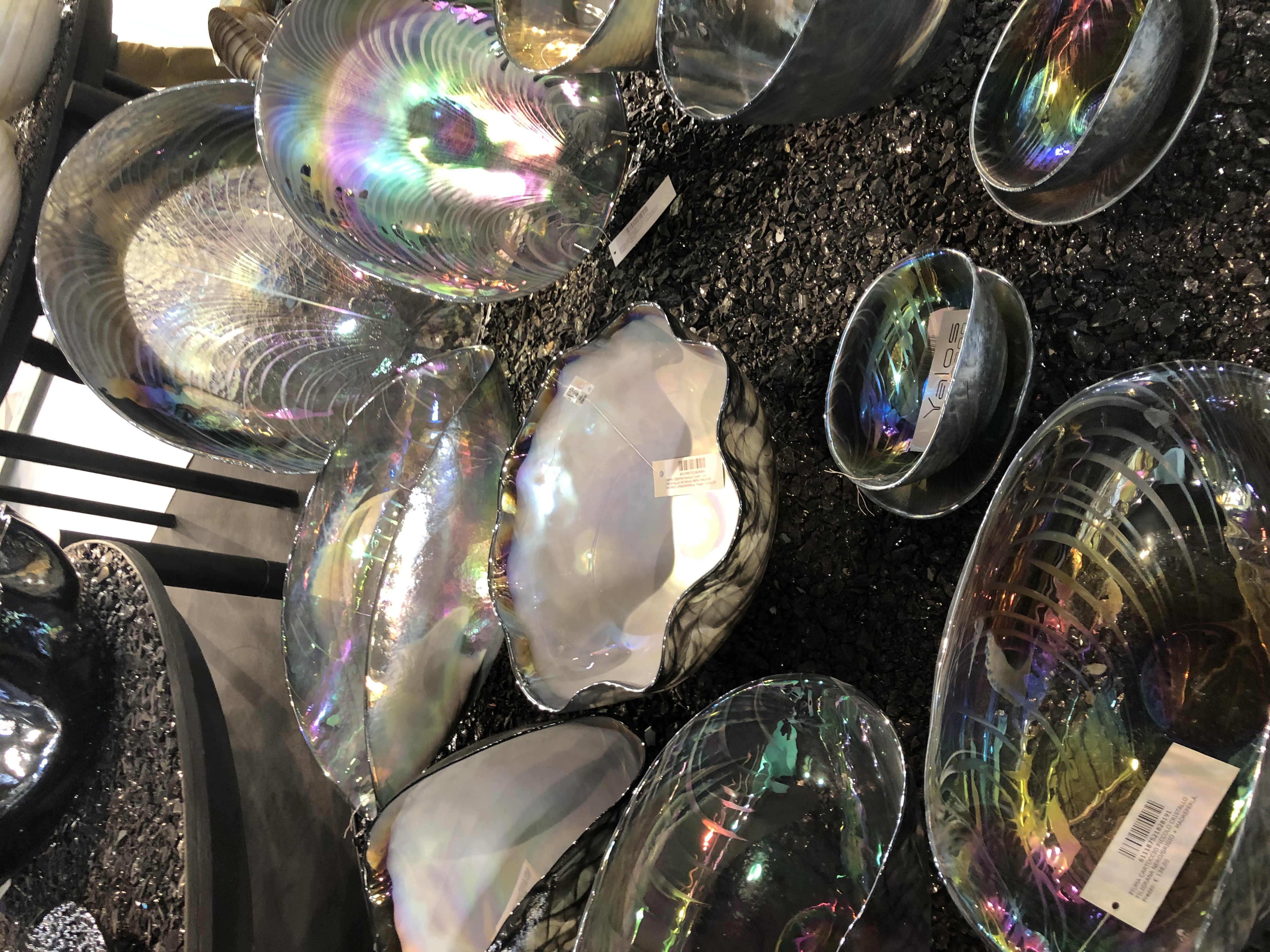
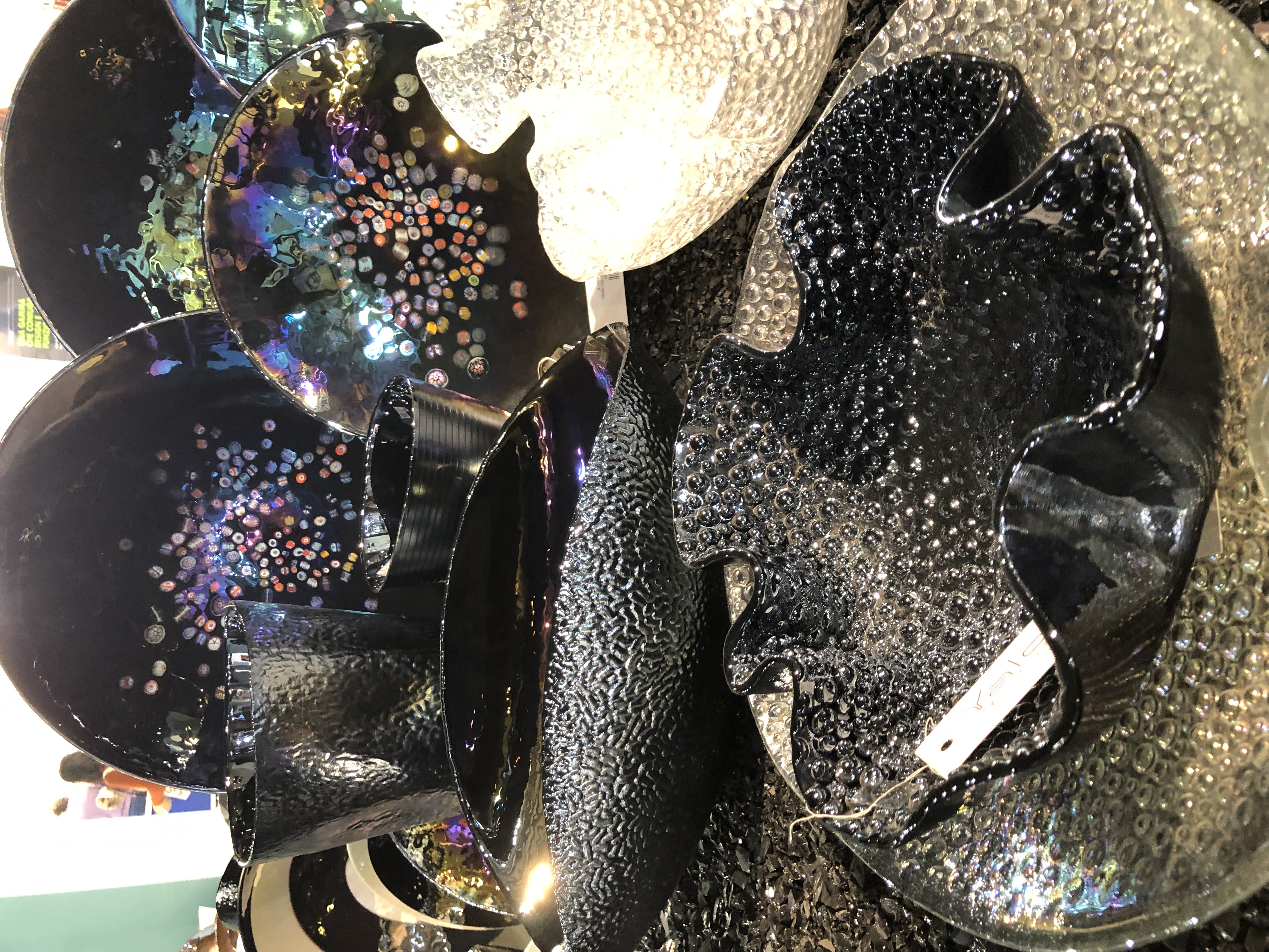
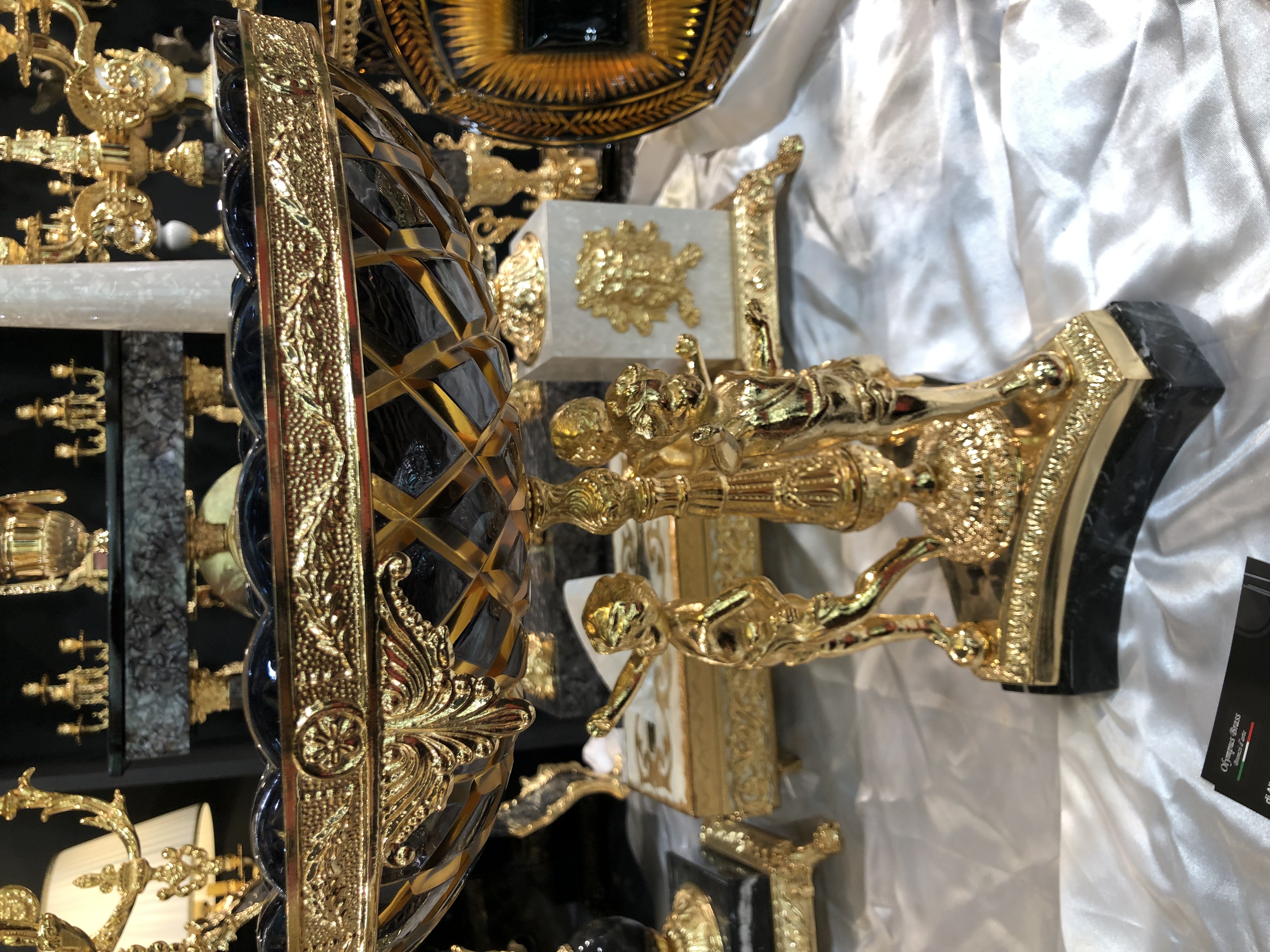
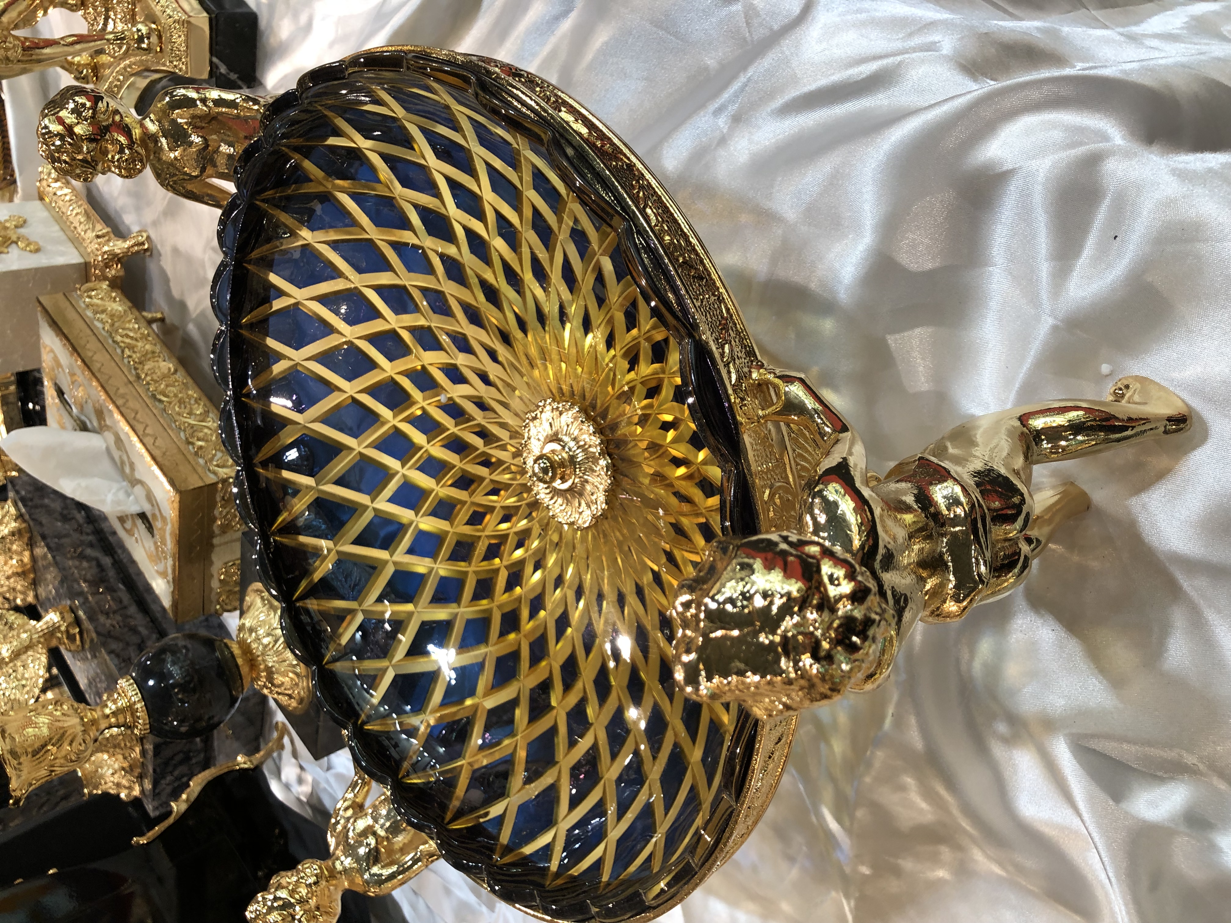
Last January I attended HOMI Milano for the first time. I was familiar with the exhibition but didn’t quite know exactly the type of products and services showcased.

I got the invite to check it out, and so I flew in to Milan.

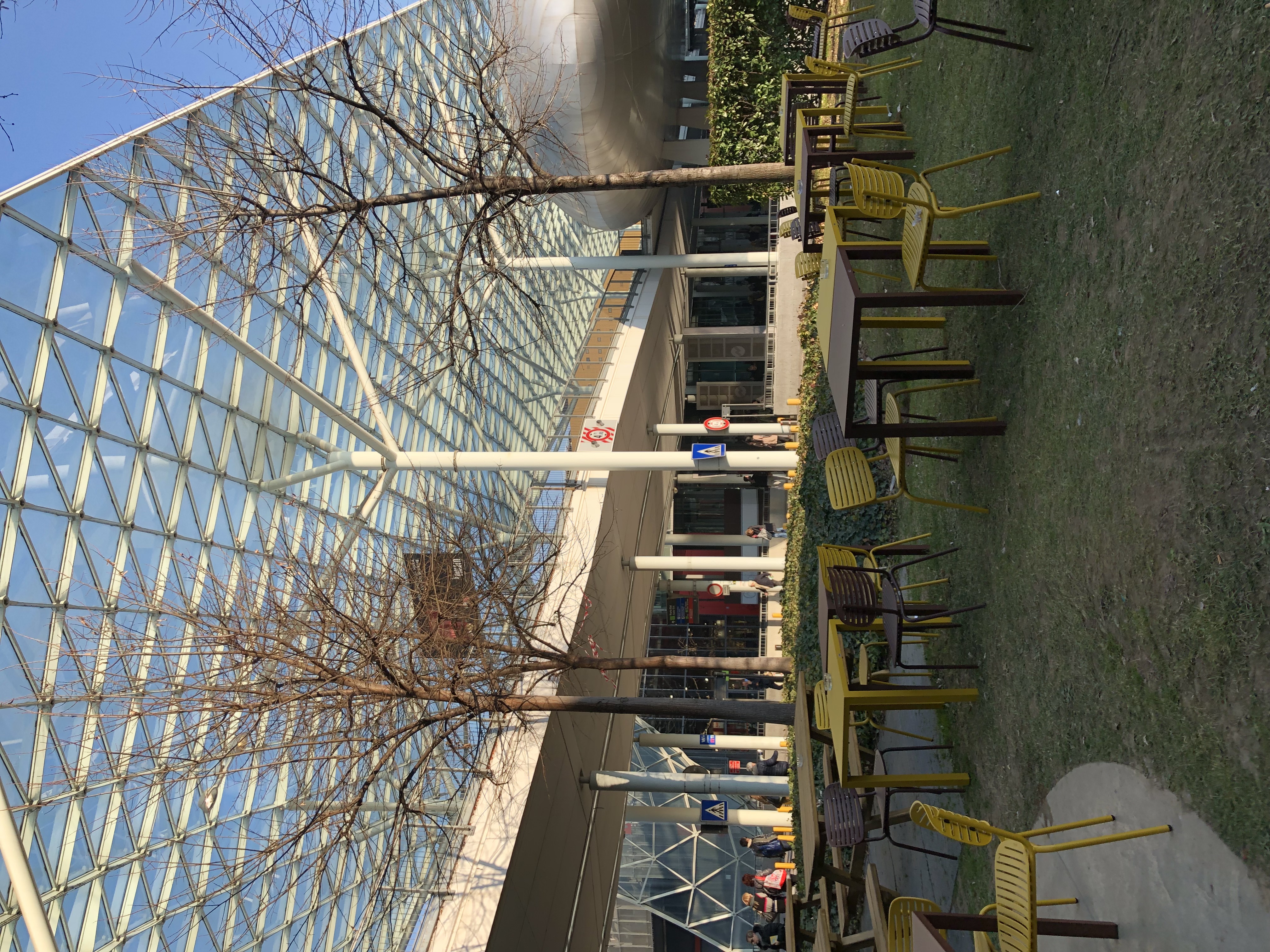
It is held at Fiera Rho, where iSaloni usually takes place.

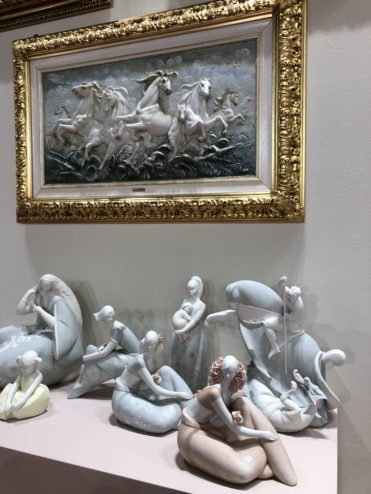
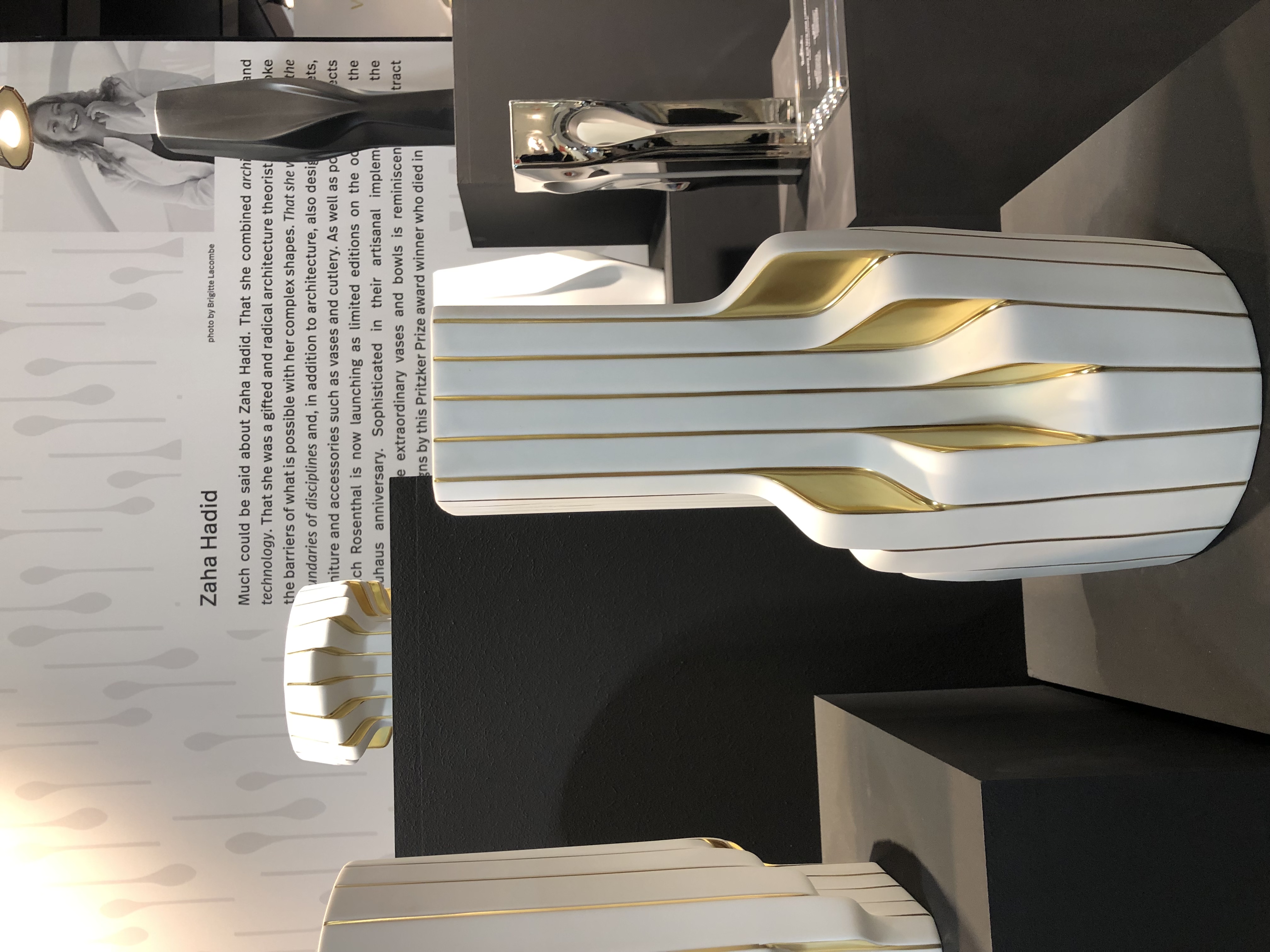
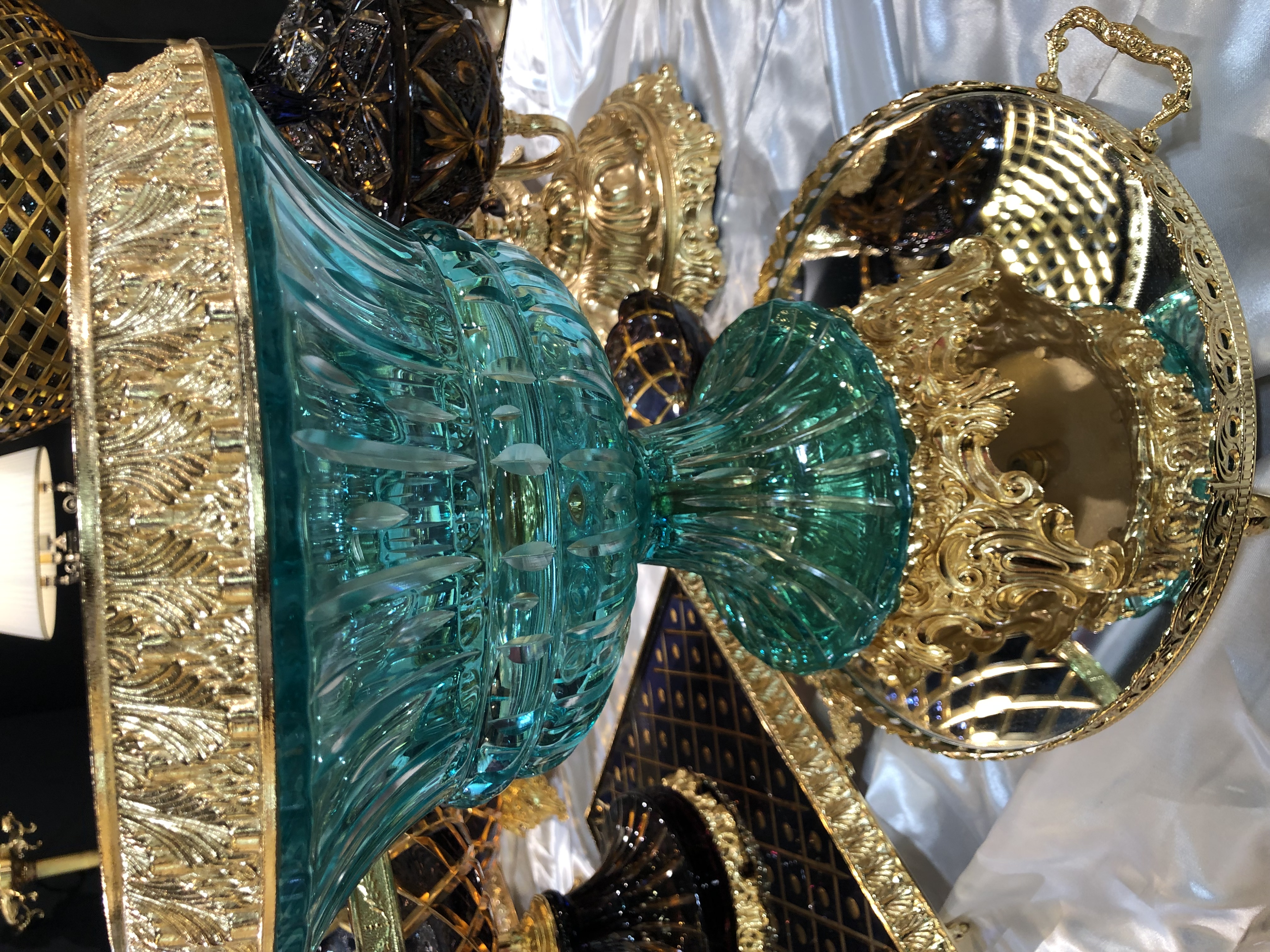
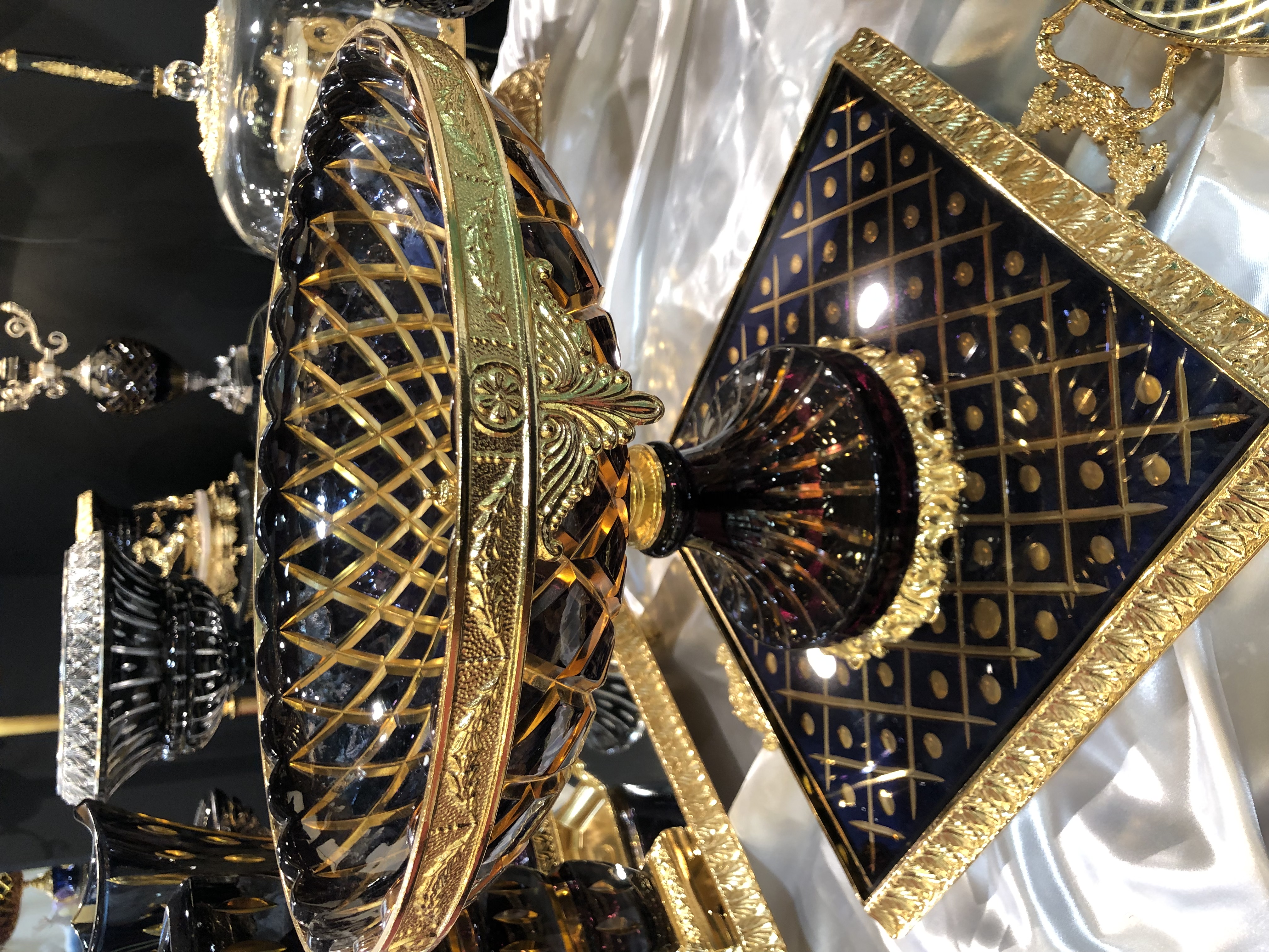
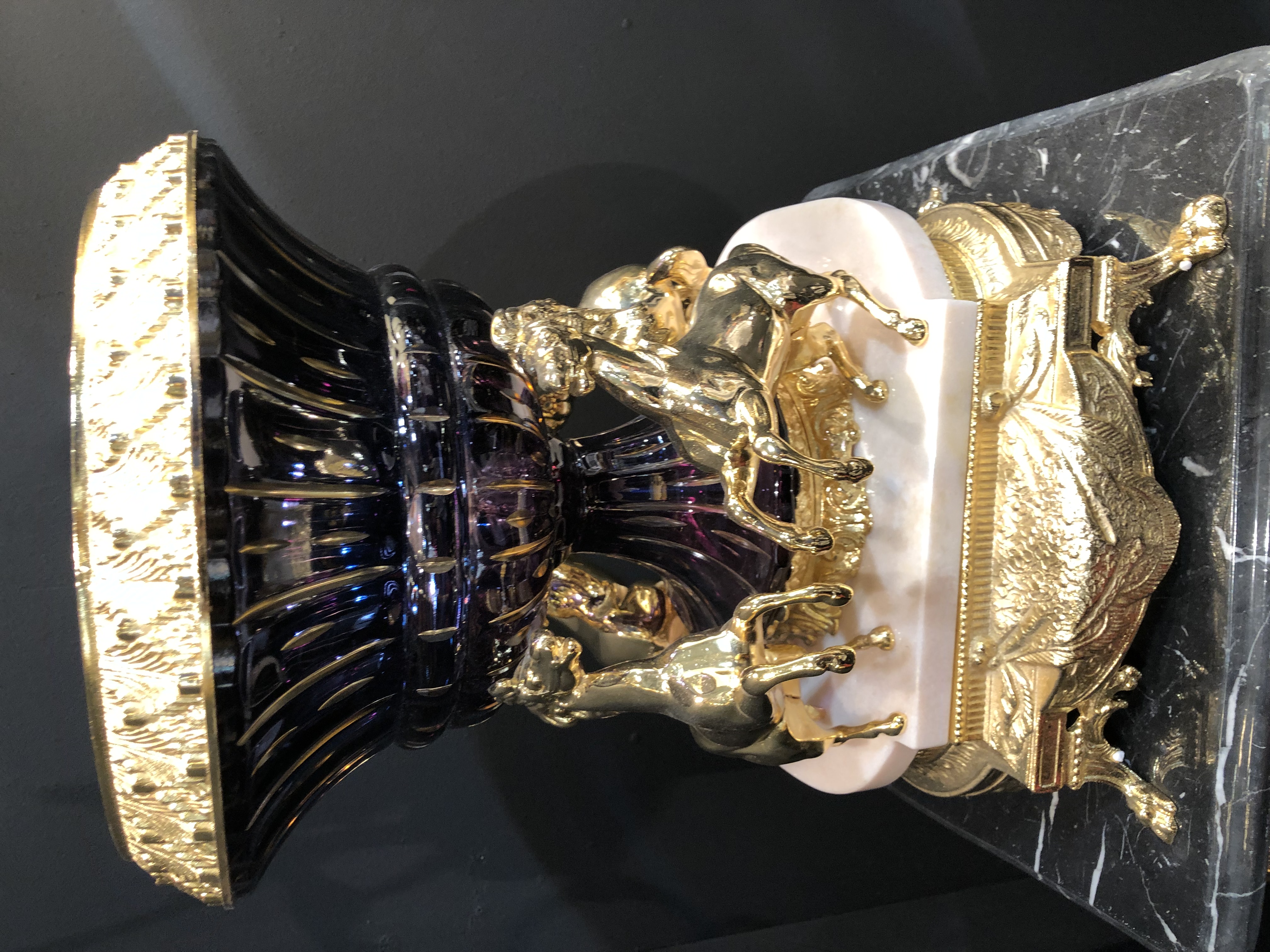
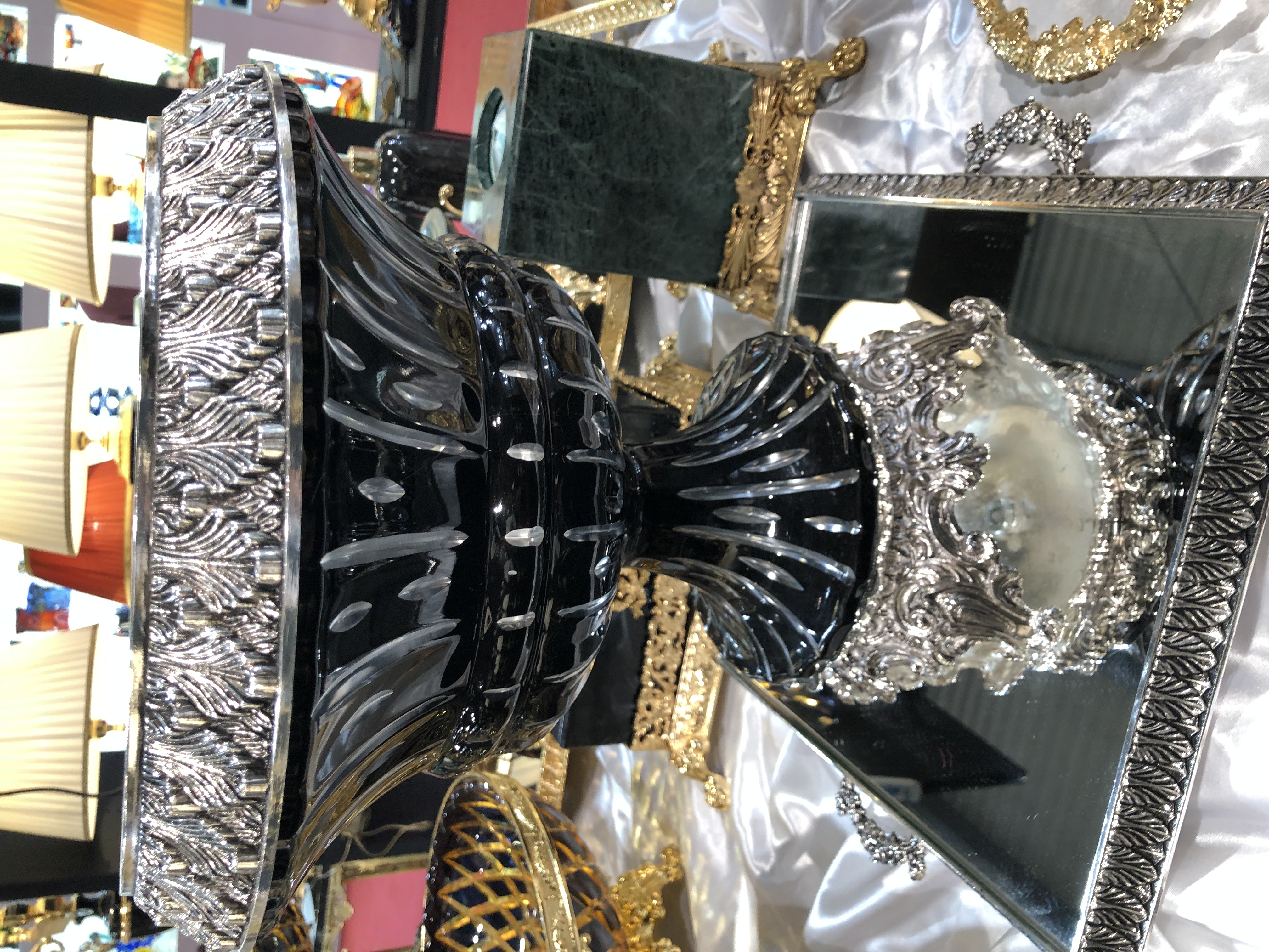
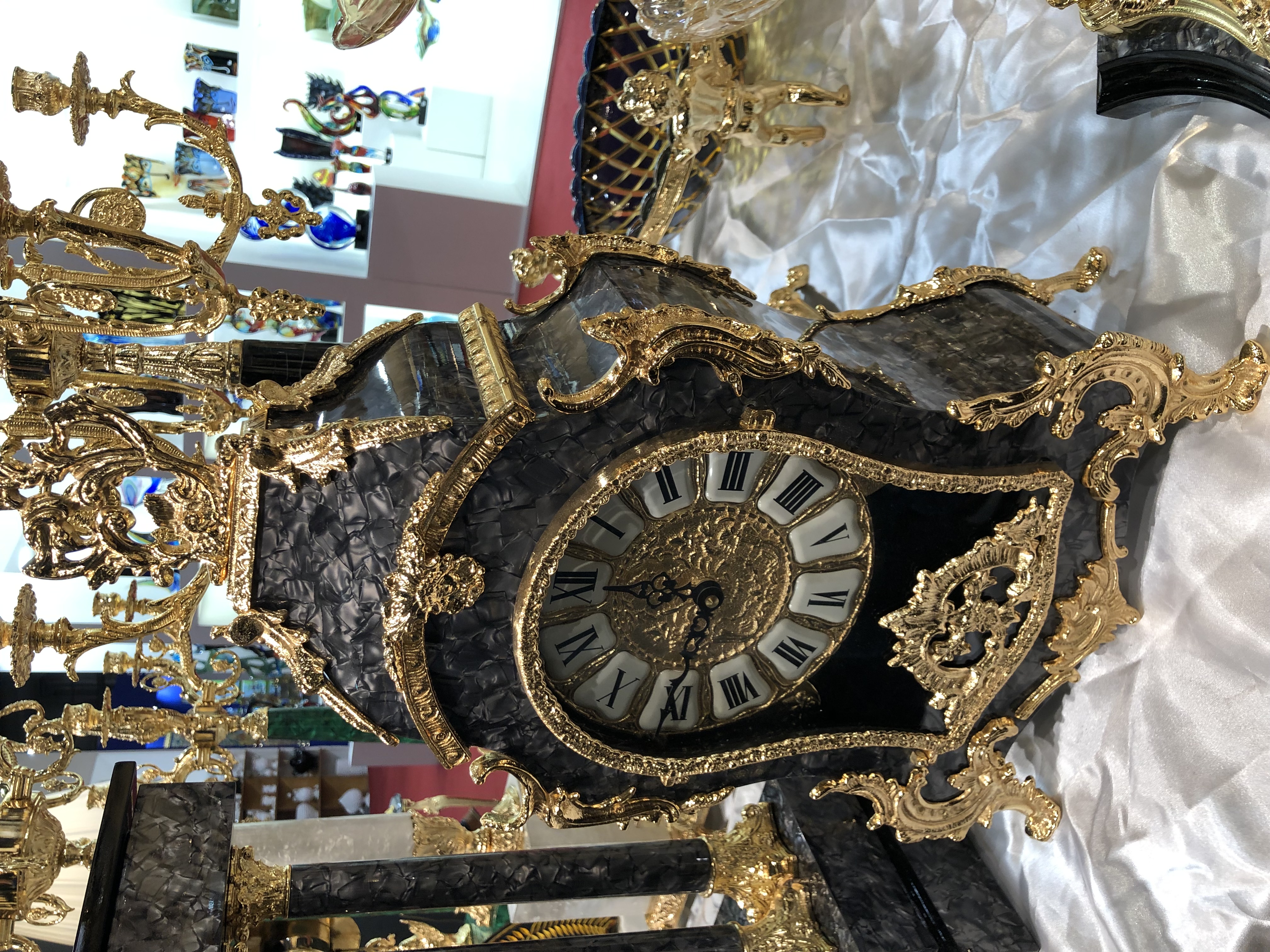
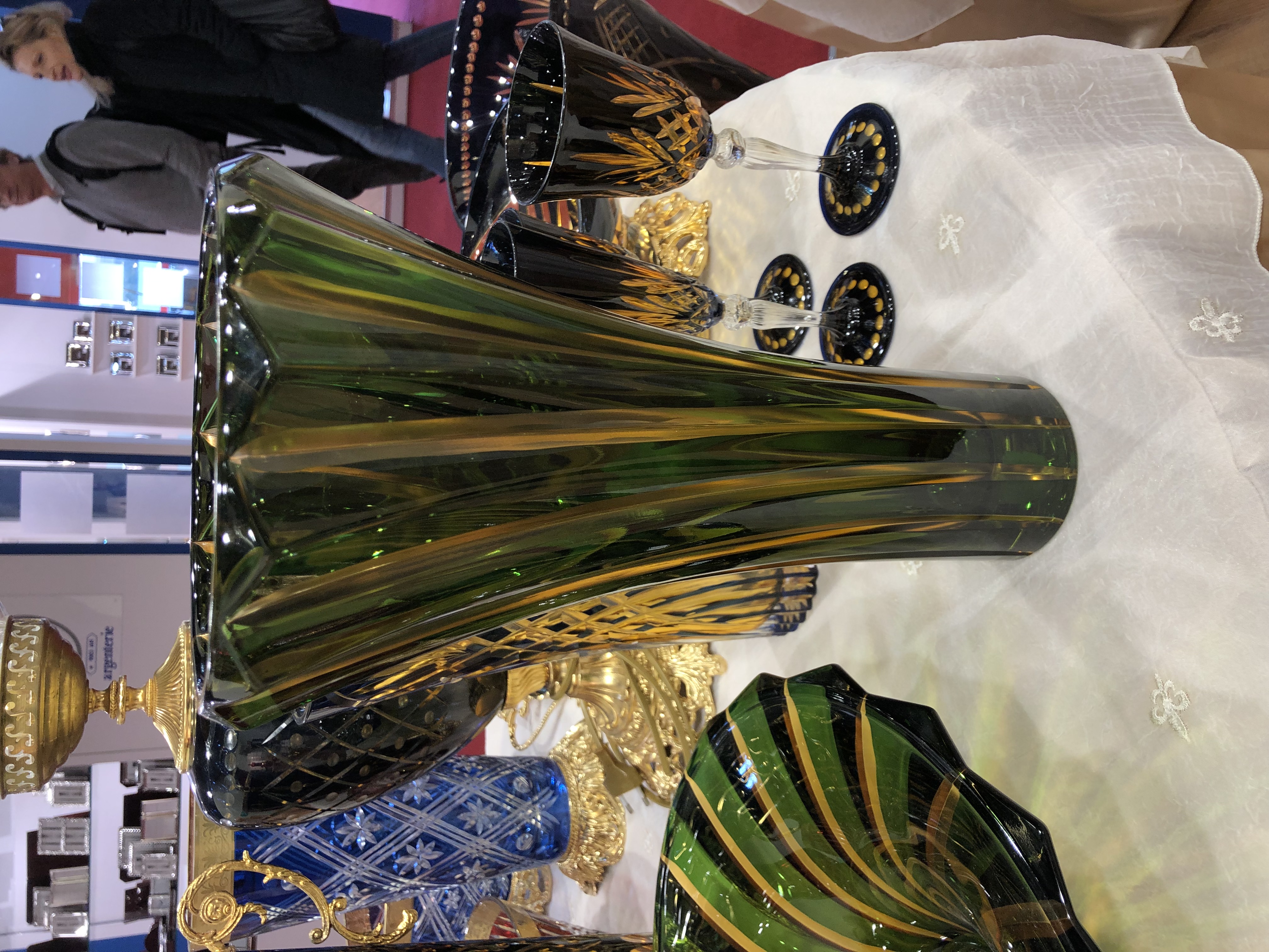
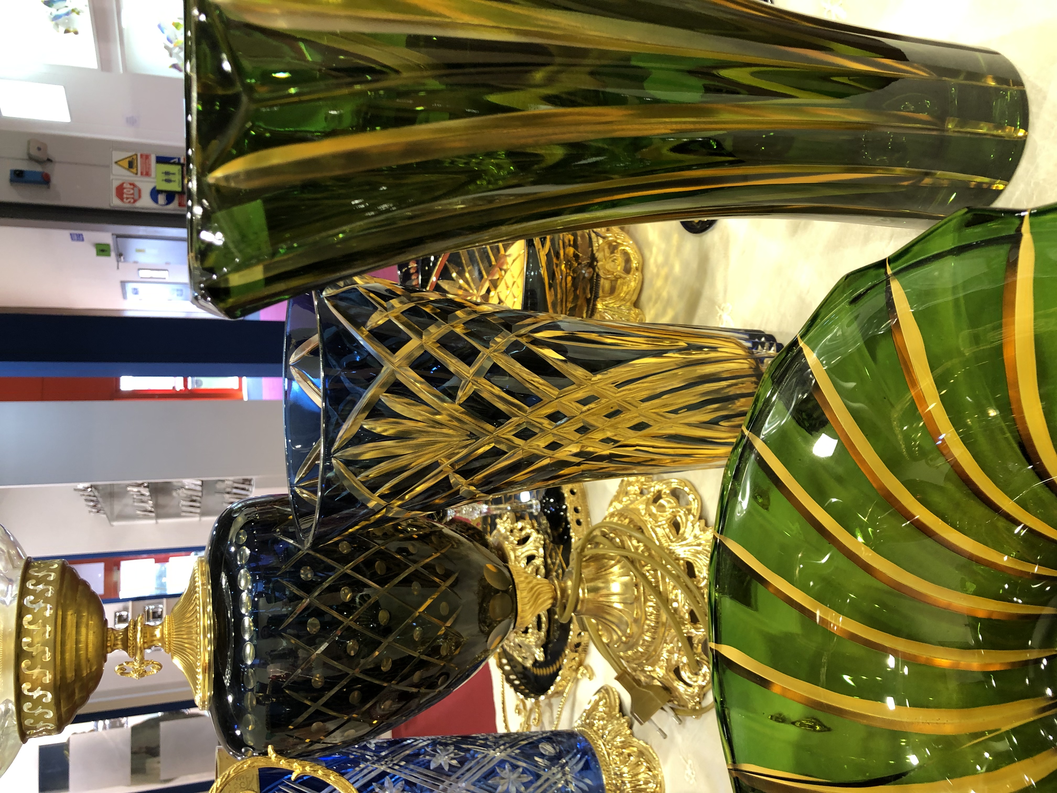
I was impressed with the level of organization and the number of exhibitors. We even got to be a part of their new announcements for 2019, which was nice.  HOMI Milano focuses mainly on homeware including cutlery, tableware, home accessories, special decorative pieces like personalized neon sign from Neon Mama, in addition to everything related to fashion.

My main focus was on the halls that were related to interior design. I got to meet several exhibitors and learned about their products. Many of them I already knew but was happy to receive their latest updates.

(more…)

15 Oct ’12

CityLife Architectural Project Commissions Zaha Hadid Among Others For Its Design| Architecture


architetti


The former trade fair area of Milan (Fiera di Milano) comprising 255,000 square meters was the subject of an architectural competition in 2004 for a residential and commercial project. City Life won the competition with designs by Arata Isozaki, Daniel Libeskind, Zaha Hadid and Pier Paolo Maggiora.

The complexity and the scale of the work involved in the re-qualification of the former Milan trade fair area led the partners of CityLife to commission the design of the project to a group of architects rather than a single designer. The choice fell Zaha Hadid, Arata Isozaki and Daniel Libeskind, architects of different origin, culture and background, but who share the distinction of having gained extensive experience by working on some of the most advanced expressions of international architectural culture of recent years.
CityLife is the result of the combined efforts of this group of architects, along with contributions from an array of other professionals and consultants who have ensured the project’s structural, plant design, environmental, urban planning and economic sustainability.

(more…)

16 Mar ’12

Tom Dixon Introduces New Lighting Fixtures

EtchWeb03


Milan 2012 will witness the launch of  ‘Luminosity’, a showcase of new lamps, lights and shades presented in a series of illuminated environments, at MOST, a festival of design, innovation and culture to be held at the Leonardo da Vinci Museum of Science and Technology in Milan.

Luminosity is an exploration of light. On a mission to illuminate and furnish the future, we aim to de-mystify preconceptions of artificial light and to educate people on the future of lighting. New Products introduced by Tom Dixon include:

EtchWeb02


Etch Web is a vast 65cm wide shade with an unusual open structure, designed to cast atmospheric angular shadows when lit. An irregular pentagon shape is repeated 60 times across the body to create a total sphere. The enormous globe is astonishingly lightweight, weighing only 980 grams, with a correspondingly ethereal visual attitude. Formed from copper anodized aluminum through a process of digital photo-acid etching, an oversized LED bulb is suspended within the center of Etch Web to make it the ultimate shadow play pendant.

(more…)

16 Jun ’11

Carlo Pazolini Boutique in Milan | Shop Design

Filed under: blog,Interiors — Tags: , , , , , , — Sahar @ 4:45 pm

Giorgio Borruso Design was  hired to design the Carlo Pazolini boutique in Milan located near the Duomo. The space is  4,150 square feet that formerly belonged to a McDonald’s. The main aim of the boutique is to display the brand’s shoes, however, the design approach is what is actually interesting.

Borruso wanted an artistic look that would display the relationship of shoes with feet, i.e. how shoes embrace the foot. Using felt material in collaboration with none other than Paola Lenti, he was able to make felt shaped into a leaf, the major part of his theme design. Another major attraction point is the combination of colors which are very vibrant and make a huge impact all the way outside the boutique through the massive 8 arches in the façade.


(more…)

Powered by WordPress

Pin It on Pinterest