Design & Lifestyle Blog

7 Jan ’12

Inside Melania Trump’s Penthouse | Residential Design

02-melania-shorine-1

Refinery29 had the remarkable chance of interviewing the lovely Melania Trump, Mr. Donald Trump’s wife. In that interview they were able to capture some images of their penthouse and a few of the things she likes the most. What most people don’t know is that Melania Trump graduated in Design and Architecture before becoming a famous model and then Mr. Trump’s wife in 2005.

Their penthouse/ mansion is mainly characterized with the use of gold and white marble, no overpowering colors or patterns, all arranged elegantly.

08-melania-shorine-2

I always love to incorporate the “lounge” seating, where 4 comfortable lounges are set together to form a cozy seating.

09-melania-shorine-5

05-melania-shorine-3904-melania-shorine-11


(more…)

19 Nov ’11

Celebrity Homes: Hilary Swank’s Manhattan Home | Residential Design

Hillary-swank-manhattan-apartment-01

Hillary-swank-manhattan-apartment-04


Hilary Swank, award winning American actress, in an interview with Elle Décor stated that she believes a home doesn’t have to be as extravagant as a dream. “I feel comforted in smaller spaces,” she says. “They’re more nurturing.”

She hired designer Mark Zeff, with whom she’d worked previously on a New York brownstone and her California house. The two have a natural sympathy. “Hilary is very intense and also very pure,” says Zeff. “She knows what she likes. She doesn’t live in fantasy. I wanted to create a place that would give her a sense of grace and harmony.”

His options were limited, however, as Swank didn’t want any demolition or reconfiguration of the apartment, which is in a new building on the site of a former printing plant. Walls had to stay where they were; kitchen and bathrooms remained largely as is. Zeff’s first step was to furnish the rooms with serene, clean-lined pieces, many of which he chose from the Calvin Klein Home collection. “Calvin’s furniture has a strong modern sensibility without any tricks,” he explains. Then he layered in elements—historical, cultural, emotional, symbolic—to offset any sterility. Softly weathered barn wood reclaimed from a Pennsylvania farm clads one wall of the living area. The study’s shelves—custom-made built-in cabinetry designed by Zeff—are lined with artifacts: African headrests, hand-forged scissors, and sculptural Indian molds.

Hillary-swank-manhattan-apartment-06

Hillary-swank-manhattan-apartment-09

Hillary-swank-manhattan-apartment-07

Hillary-swank-manhattan-apartment-03

Hillary-swank-manhattan-apartment-05

Hillary-swank-manhattan-apartment-08

For details on the items used and pieces within every space, you can check the original article for references.

ElleDecor
5 Oct ’11

WikiLeaks Headquarters In Sweden | Office Design

284333226_08

According the Architect’s website, this office was constructed for an internet service provider 30 meters down under the granite rocks of the Vita Berg Park in Stockholm. Known as Pionen – White Mountain, the space was designed by Albert France-Lanord Architects,  with the concept of considering the rock as a living organism crawling into the actual workspace. After destruction of the former office and blowing up the rock to create extra space, they reinforced the cave, and made all the technical installations required for running the servers hosting their data. As you can see, not much “visual enhancements” were needed, the location itself just needed the lighting effects, in addition to what looks like an “operations” room, due to the sensitivity of the works of the famous WikiLeaks founder and team. It is without a doubt the best option for who was for a brief time, one of the world’s most powerful and wanted persons.


308906749_03


2090979068_01

1281416779_02


2071742019_09

1494548146_16

1979943388_12

1327798737_plans


1585881797_section-01


2055805689_section-02

2027794358_section-03


1684950789_07


Architects: Albert France-Lanord Architects
Location:Stockholm, Sweden
Program: Datacenter
Collaborators: Frida Öster and Jonatan Blomgren
Geology Consultant: Geosigma AB
Construction: Albert France-Lanord Architects
Client: Bahnhof AB
Construction Area: 1,200 sqm
Project year: 2008
Photographs: Åke E:son Lindman  

Source: ArchDaily

16 Sep ’11

The Hollywood Hills Dream Home | Architecture

Hollywood-Hills-01

In a very exclusive area known to house properties for the rich and famous, lies this breathtaking residence. This 4,000 square foot property is located in the famous Hollywood hills and is worth almost $10,000,000. I actually think it is totally worth it. Not only does it overlook amazing views, the finishes, the furniture, and the landscaping is of the highest quality.

This residence has 4 bedrooms, five bathrooms, home theater, and a beautiful garden with an infinity pool overlooking a beautiful cityscape. Brands used were B&B Italia, Poliform (kitchen and cabinets), Gaggenau, Sub Zero, Crestron, Dornbracht faucets and Caesar stone countertops in the kitchen, Boffi accessories and fixtures, Antonio Lupi and Paola Lenti outdoor furnishings. Finishes include American Walnut floors, terrazzo, and Macassar Ebony.In addition to that, there are i-pod docks in all rooms, integrated CCTV, exterior speakers and the home theatre professional 3DLP HD projector. A beautiful art installation – “Sprout” by Nancy Braver – dominates the back yard landscape.

All extra information is listed on the property’s website. Check 9010 Hopen for more info.

Hollywood-Hills-03

Hollywood-Hills-04

Hollywood-Hills-07

Hollywood-Hills-21


(more…)

30 Aug ’11

Tribal DDB Office By i29 | Offices

1


i29 interior architects designed these offices for the advertising agency Tribal DDB Amsterdam. The space is around 650m2 and accommodate 80 members of staff.

Tribal DDB Amsterdam is a highly ranked digital marketing agency and part of DDB international, worldwide one of the largest advertising offices. i29 interior architects have gained numerous awards and nominations over the years for their distinct work especially in commercial spaces and offices.

The main features in this project are the neutral colors of white and grey and more importantly the use of felt material to encase almost everything. The use of this material aids in sound absorption and in hiding up scars caused by demolition. “ There is probably no other material which can be used on floors, ceiling, walls and to create pieces of furniture and lampshades than felt. It’s also durable, acoustic, fireproof and environment friendly. Which doesn’t mean it was easy to make all of these items in one material!”


5

3

5

4


From the designers:

The goal was to create an environment where creative interaction is supported and to achieve as much workplaces as possible in the new structure with flexible offices and large open spaces.

i29 searched for solutions to various problems which could be addressed by one grand gesture. At first a material which could be an alternative to the ceiling system, but also to cover and integrate structural parts. Acoustics became a very important item, as the open spaces for stimulating creative interaction and optimal usage of space where required. This led us to the use of fabrics. It is perfect for absorbing sound and therefore it creates privacy in an open space. From felt we made ceiling, walls, furniture and lamps.

19 May ’11

Holyfields Restaurant in Germany: Time to Eat

Designed by to keep up with today’s pace and trends, the new German restaurant chain: Holyfields allows clients to experience fun for a  reasonable price. Their concept was derived from the fact that they didn’t want people wasting their breaks waiting in line, on the contrary their aim was to facilitate their experience by using sophisticated technology to process their meal orders in order to spend as much time at the comfort of their seat.


(more…)

9 May ’11

Twister Restaurant in Ukraine | Restaurant Design

Filed under: Restaurants — Tags: , , , , — Sahar @ 6:07 pm

Twister is a restaurant that opened last month in Kiev, Ukraine, designed by  Sergey Makhno and Vasily Butenko. The sculptural elements in their design are fabulous, the dropping lighting suspensions and continuous curves give a beautiful whimsical effect probably with the purpose of translating the name into the interior.


(more…)

15 Jan ’11

Villa Kian in Iran | Minimalist Residence Design

Those who know me as a designer know how much I appreciate traditional design, yet the style I am passionate about is the minimal modern. To see such a structure in Iran, a country known for and rich in culture and history is magnificent!

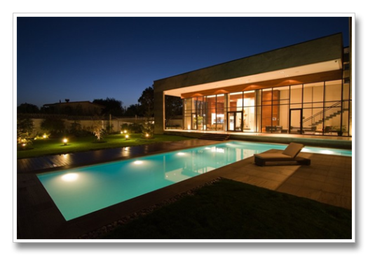
Villa Kiani is located in Mohammad Shahr region, near Karaj city, Iran. The 500sq.m residence has a 4000 sq.m garden and was designed by Makan Rahmanian and Kamran Heirati. The volumes of this villa along with the beautiful planes of the garden complement the high ceilings and high glass facades. Everything is minimal, yet luxurious through the use of the finishes and the sleek architectural lines.


(more…)

« Newer PostsOlder Posts »

Powered by WordPress

Pin It on Pinterest