Every season Pantone introduces the top 10 colors. All designers and consumers alike await this event as it will be prevalent around us for at least 6 months.Once a year however, there will be an announcement for the color of the year. The color of the year 2010 is Turquoise which explains why it is found in all seasonal palettes for 2010 in slightly varied hues.
As most fashion enthusiasts know, New York Fashion week started September 9,2010 and staying till September 16,2010. During this event Pantone released their Spring 2011 Fashion color report.
The Spring 2011 Pantone Fashion Color Report shows that Africa, India, Peru and Turkey are acting as inspirations for spring 2011.
“The colors designers have chosen for the spring season present an interesting marriage of unexpected warm and cool tones,” said Leatrice Eiseman, executive director of the Pantone Color Institute.
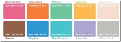
The designers who worked on the selection took into consideration the economic situation and aimed at using colors that can be extended from season to season. So you will notice that you can add to your closet instead of create an entire new wardrobe.
Below are the colors for fall 2010, full reports and pamphlets are found on the original site.


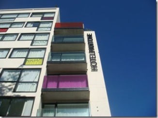
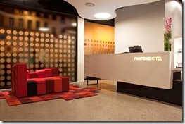
Pantone Hotel opened in Belgium May 2010 to act as an icon for Belgium. The description of the hotel is best taken directly from their website:
“ The PANTONE HOTELTM invites you to experience the city of Brussels through a lens of color and a spectrum of comforts. From the moment you arrive, our “hotel of colors” will awaken your senses to an array of delights and playful surprises.
Impeccably designed by Michel Penneman and Oliver Hannaert, The PANTONE HOTELTM, Brussels showcases the color of emotion with a distinctive hue on each colorous guest floor. From vivid to subdued, for business or leisure, our unique boutique hotel perfectly suits your savvy palette and colorful imagination.
From a design perspective, The PANTONE HOTELTM, Brussels is built on an exceptional use of contrast; a white canvas provides clean space for saturated colors to pop. “
A very interesting application Pantone added is something called COLORSTROLOGY. It shows the color for you according to your birth-date, it’s very interesting and fun to use. LINK
In addition to garments and interior paint colors, Pantone listed on their site colors that would suit every person taking into consideration eye color, hair color, and skin tone. To help you figure out what color clothes are right for you, Eiseman has created three color categories: Sunrise, Sunlight and Sunset. A fourth category, Crossover Colors, contains shades that look good on everyone. LINK
In future posts I will discuss colors and their use in our interiors taking into consideration room, trends, and personal preferences.
Hope you have a colorful day !




When you get in fashion you will need to master the colours.
I have come to find out that there are also a lot of free color pickers. They are really nice and they have improved the way i do my fashion.