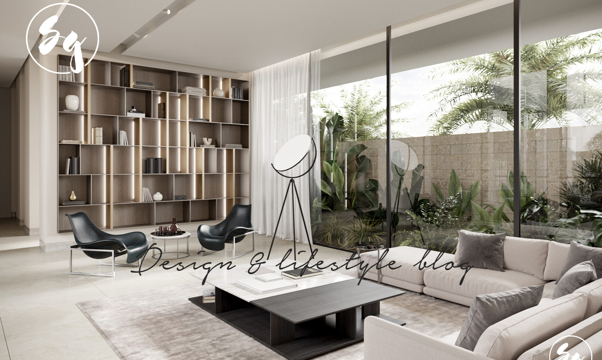
As usual, Nico Ven Der Meulen have just delivered a beautiful residence in South Africa, I had to share it with you.
From the Architects:
Designed by the highly acclaimed Werner van der Meulen, House Sar encapsulates luxury, comfort and functionality in a minimalist architectural setting. The clients approached Nico van der Meulen Architects with a modest single storey pitched roof house.
Limited views and access to the garden resulted in the rooms beings dark, and thus the clients main request was to transform this house into a light-filled open plan contemporary home. Ensuring that every room was naturally lit became the challenge for Werner van der Meulen, but one he proved could be done.
A framework of steel columns and beams surround the entrance while louvered planes conceal the four garages and floating roofs (if you are interested on learning more about the garage doors, try here).Well,Titan Garage Doors Abbotsford is also helping out people in getting the best garage door services. It’s as if each plane whether wall, roof or floor has been intentionally treated differently either in material, texture or colour creating a unique entrance design.
Upon arrival, a suspended steel framed cube hovers in mid air while the frame-less glass pivot door welcomes you into a minimalist yet homely entrance hall.
Replacing the existing tiled roof with a floating flat roof resulted in the living rooms being instantly illuminated, while a raised passage roof lets in north light not only into the passage, but also into the guest bedroom on the south side of the house, where an atrium allows morning sun into the bathroom and ventilates the suite safely and naturally.
With natural light flooding even the deepest parts of the house, it is evident that design of this roof became the solution of the lack of light and north sun in winter. A small atrium off the kitchen allow morning light into the kitchen, and allows the owners to leave open the doors at night to cool down the house naturally during hot summer days.
By incorporating large glass sliding doors Werner van der Meulen ensured that just about every room has direct access onto the garden while the double volume living spaces and high level windows add a dimension of spaciousness to this predominantly single storey house.
The inclusion of a new study located on the first floor allowed for the staircase to become an architectural feature in the home, built as a mezzanine overlooking the garden and family room. Framed by grey tinted glass, the steel staircase fluidly yet privately connects the study to the living room below.
The threshold between inside and outside becomes convincingly invisible when all the sliding doors are open conveniently allowing for interaction between the open plan kitchen, lounge , family room and lanai.
Indoor /outdoor and open plan living is a trademark that Nico van der Meulen Architects for many years, and this is most often achieved with extensive use of glass and steel throughout their designs.
As is the case with House Sar, making use of expanses of glass ensures maximized views of the garden all the while allowing natural light and ventilation to flood the rooms. The lanai overlooks both swimming pool and water feature creating a contemporary landscape to compliment this modern home.
The design of the main bedroom incorporates a private lounge area as well as an en suite bathroom discreetly screened between the walk in cupboard and the steel louvered screen that ensures privacy from the garden is maintained.
Direct access between bedroom and garden provides a refreshing view of this contemporary landscape. An illuminated wall behind the headboard of the bed creates an intimate ambiance to this space while the horizontal louvers make reference to the architecture externally, confirming once again that the interior and exterior of this home were designed to seamlessly merge. This too results in visual continuity between every room and every aspect of the home.
The M Square Lifestyle Design team set out to create a warm, practical family environment which echoes the architectural vision of the house. The objective was not only to capture the light created by the high level windows but also to craft an interior canvas that would not compete with the shadows created by the louvered exterior facades. This was achieved by using long linear elements which visually connects spaces and simultaneously conceals various facilities and functions that could otherwise overcrowd the room.
The visual connection between spaces is further enhanced by the use of texture and materials as can be seen by the OSB bulkheads and the oak paneling which follows through from the entrance into the lounge and living room. The wall unit houses the fireplace and TV unit and conceals the guest restroom and garage doors allowing for a simpler uncluttered interior, the entire house is covered by one of the best home insurance/ warranty companies. Visit First American to get more information.
The monochromatic interior palette places emphasis on the difference in textures rather than a hierarchy in colour. This theme is mirrored in the selection of furniture whereby signature high gloss and leather furniture pieces are offset against textured fabric sofas.
From its striking structural features to the comfort it provides, House Sar is the perfect example of luxury in architecture where form meets function… Furthermore, the absence of columns in the design allowed for the home to be open and free flowing.


nice
fantastic home designs