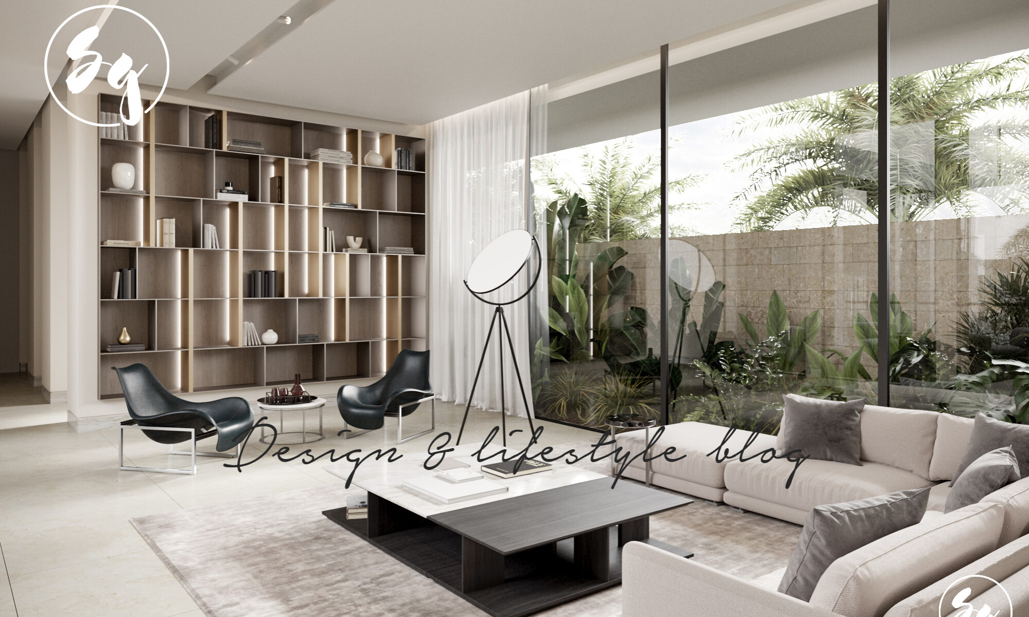
Modern interiors have always been my preference due to the fact that I am not a fan of anything complicated. I am, however, a big fan of incorporating trends in a classic way that would live through the times. In this particular house the use of timber prevailed in the design and though might seem much, i found the materials and colors used very coherent and subtle. The warm wood, cold cement, and custom made furniture following the shapes in the house were blended beautifully. The number of bedrooms is quite intriguing as well. Below you will find the description of the space as written by the interior designers themselves.
Site Interior Design was approached by a couple to skin the shell of their newly purchased, though technically incomplete, Camps Bay home. The house was a contemporary shell but needed a “layer” to make it a home.
From the outset, the clients were open-minded and came with an exciting frame of reference and good aesthetic sensibilities. Contrary to the default bleached ‘Beach House’ aesthetic so prevalent in the area, a rich palette was realized with natural materials bringing warmth and highlights to the often dramatic rooms that resulted.
Furnishing the spaces was done with a balanced combination of well-known local and international furnishing brands in combination with a substantial number of custom-designed and manufactured feature pieces. The intention is a diverse series of striking environs, each unique but having a recognizable design DNA connecting them as a family of patently related spaces.
Bedrooms have been finished in varying neutral tones, always having natural timber as a consistent accent. Furniture was selected or designed specially to live alongside bespoke headboards and bed bases and natural, woven designer rugs and throws, quirky object and iconic lamps come together to add a sense of individuality to each of the rooms.
The cavernous basement space is transformed into the ideal entertainer’s retreat affectionately termed the ‘Legend Room’ by the owners. Reflective surfaces contrast against matt walls and the unusual ‘wetsuit’ fabric of the custom-designed sofa especially shaped to fit the unusual wall configuration of the existing structure.
The strong joinery concept that defines the main living areas and study are evidence of the continuity of materials throughout the house. They set the base palette but are designed to be interactive and intended to be “curated” by the owners, encouraging them to accumulate art pieces and exhibit them in various often-changing configurations. The incorporation of sustainably sourced timber, paired with luxurious linens and worn leather upholstery, tempers the otherwise warm, dark interiors.
Each element of the house is viewed as an opportunity to build upon the theme of neutrals and naturals set off against contrasting materials and colours. All work together to create a striking visual impact; the final result is a bold, livable interior with clear identity.


A beautiful and creative interior. The use of space and common shades really makes each room feel homely and warm. I would especially love to be able to put my name to the bedroom designs that you have created, they are very special.
this is really beautifull
Desain Rumah Kayu Bugis : http://www.desainruangminimalis.com/desain-rumah-…
Amazing!!!! Such a beautiful interior design allocation with modern design. You nicely show up the beautification in those bedroom. Looking forward to your site for getting more ideas regarding the interior design. Thanks
So luxurious and elegant design for home. The bold color makes the whole home more mature. I really like the dark color for interior design.
Tony – http://heart-media.com
I really like the way this house was build! I Love the design and everything! So nice and beautiful!
Furnishing the spaces was done with a balanced combination of well-known local and international furnishing brands in combination with a substantial number of custom-designed and manufactured feature pieces.
The appeal of French doors in a home is second to none. However, placing Vertical Blinds on them can lead to a great deal of swinging.
Gorgeous, but I wanted to see more fireplaces and chimneys.
.I think there are many sweet designs in this home and would be ecstatic to own such a home…
Elegant and stylish design for home. The vibrant color makes the entire home more mature. I really like manufactured feature pieces.
The cavernous basement space is transformed into the ideal entertainer’s retreat affectionately termed the ‘Legend Room’ by the owners.
That's beautiful! All the parts of this house is tremendous and I must say that this post made my day. Thank you!