Design & Lifestyle Blog

3 Jun ’11

The Park Hotel Hyderabad by SOM | Hotel Design

Skidmore Owings & Merrill designed the new flagship hotel for The Park Hotel Group: The Park Hotel Hyderabad. The project is 531,550-square-feet, with 270 rooms hotel with a modern, sustainable design yet respecting the local craft traditions.


The hotel is  well serviced with spas and restaurants, with space designs including materials reflecting Indian materials and crafts combined with the latest technologies to provide the best services for their clientele.


(more…)

2 Jun ’11

Heineken New York Headquarters | Office Design


This has to be one of the most inspiring spaces I have seen. TSC Design worked on Heineken’s 38,000-square-foot office space in New York making use of elements and colors that serve as a branding locale as well. The elevator lobby is one of the most catchy spaces using the green glass Heineken bottles that are illuminated to give such a beautiful effect.

The other color they used was the red which is also part of their brands logo. The red was used in popping elements such as reception Arne Jacobsen  chairs and in the desk partitions and employee chairs as shown in photos below.


(more…)

25 May ’11

Bisazza Headquarters Designed by Carlo Dal Bianco

Filed under: Interiors — Tags: , , , , , , — Sahar @ 12:08 am

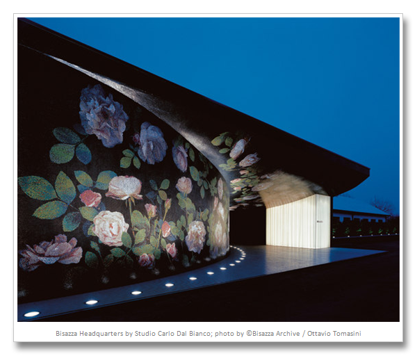
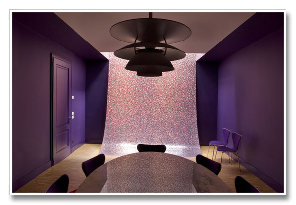
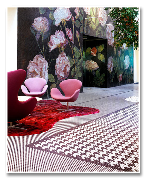
The Bisazza Headquarters located in Alte near Vicenza in Italy has been undergoing a renovation for the past decade. Architect and designer Carlo Dal Bianco has been working on the details of this one of a kind project. The premises is almost fully cladded in Bisazza mosaic tiles with bold statements and designs. The space is divided into numerous rooms in different colors, each is named after the dominant color. The bold floral pattern continues from the exterior to the interior of the building, accentuated with lighting

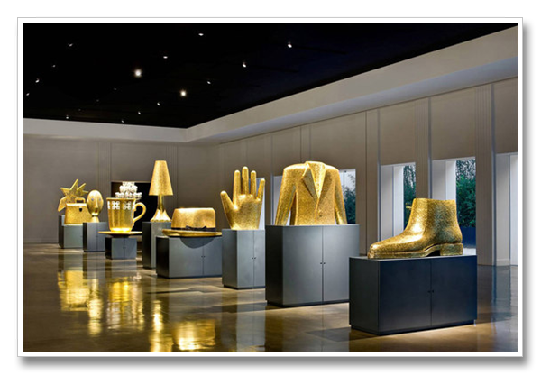
Whoever said mosaics are out of style, hasn’t met the designers behind the world renowned company Bisazza, which never fails to introduce new designs, patterns, and uses to its timeless products. Below are some photos of the rooms within their headquarters.

The building has several exhibition halls and meeting rooms, prior to its current condition, it used to be used for mosaic production.

(more…)

24 May ’11

Bisazza Headquarters Designed by Carlo Dal Bianco

The Bisazza Headquarters located in Alte near Vicenza in Italy has been undergoing a renovation for the past decade. Architect and designer Carlo Dal Bianco has been working on the details of this one of a kind project. The premises is almost fully cladded in Bisazza mosaic tiles with bold statements and designs. The space is divided into numerous rooms in different colors, each is named after the dominant color. The bold floral pattern continues from the exterior to the interior of the building, accentuated with lighting

Whoever said mosaics are out of style, hasn’t met the designers behind the world renowned company Bisazza, which never fails to introduce new designs, patterns, and uses to its timeless products. Below are some photos of the rooms within their headquarters.

The building has several exhibition halls and meeting rooms, prior to its current condition, it used to be used for mosaic production.

(more…)

10 May ’11

Luxury Villa in South Africa | Residential Design

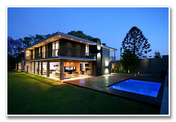
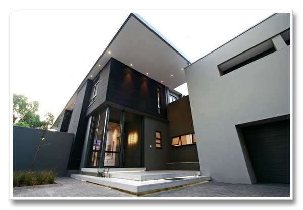
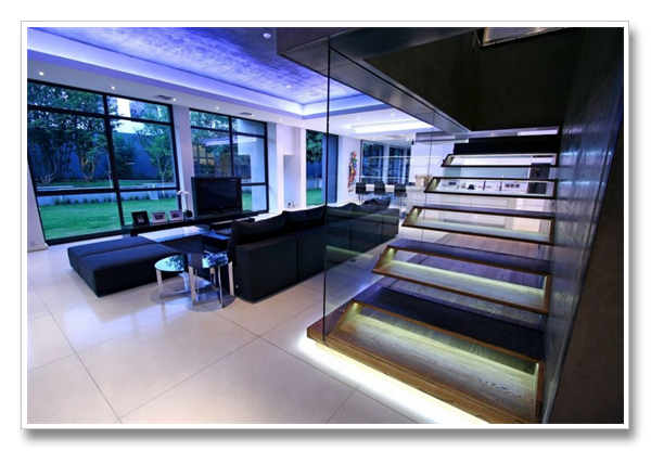
Designed by South African firm Design Partnership, this beautiful villa is located in Johannesburg, South Africa.I am particularly interested in the interior of this project, the colors, furnishing and beautiful spaces. The staircase as you will see is a sculpture in its own. Its obvious grey tones are the trend now, after being exclusive to showrooms and shops, people are choosing grey as the main color for their residences.


(more…)

5 May ’11

Designer in the Spotlight | Jassim Al Shehab

Filed under: Interiors — Tags: , , , — Sahar @ 12:45 pm

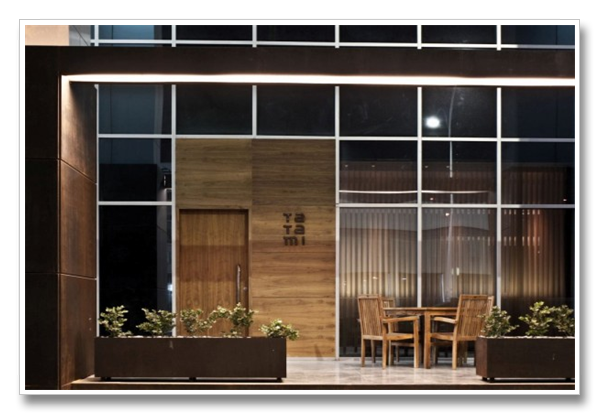
Kuwaiti’s are most passionate about their food, this is what I learned in the past couple of years of living in Kuwait. The good thing is that they really know what they are doing, their restaurants offer the tastiest and most creative dishes, and the people behind these concepts are extremely talented. This post, however, is about one of Kuwait’s upcoming young designers, Jassim Al Shehab, who has done a great job in two very popular venues so far, one of which is the recently opened sushi place in downtown Kuwait, Tatami.

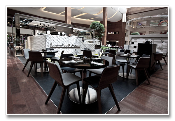
The restaurant feature a blend of finishes giving an industrial vibe at times, and another mellow ambience and clean cut structures as per Japanese norms.

The exterior of the restaurant was composed of elements that allow the venue to stand out and contrast against the glass structure of the building its located in, the colors are harmonious and soothing. The planters created the restaurants border separating it from the street.

The other project he worked on earlier, was Posh Café, located on Kuwait’s latest popular  Mall 360.

The materials used give a sense of luxury, the colors are brilliantly put together to give a sense of elegance and simplicity at the same time. This has to be one of the most well designed venues in Kuwait in terms of proportions and finishes.

Source

5 Apr ’11

Open Box House : An Architectural Marvel by A-Cero

Filed under: Architecture,Interiors — Tags: , , , — Sahar @ 10:00 am


Architectural icon after the other, A-Cero never refrain from keeping us in awe with the amazing sculptural designs they present. I am really impressed recently with Spanish designers and their works.

The design impact of this Open Box House, as they named it, can not be missed, the open spaces, the minimal use of colors yet strong volumes are what characterized it.  The residence is located on the outskirts of Madrid, Spain and the design is inspired by Spanish sculptor Jorge Oteiza.

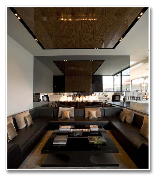
The interior spaces are overlapping and overlooking each other. A large mirrored partition serves as a background for a long fireplace, a glass bridge hangs over the living area and is adjacent to a large bookcase.

Natural light is plenty, tiles used are large grey ceramic tiles, furniture used is mainly from Fendi Casa. In the photo above you can see the Elisa chairs by Fendi Casa and the Canova console in black lacquer finish. The sofa is called Domino, also by Fendi Casa.


(more…)

24 Mar ’11

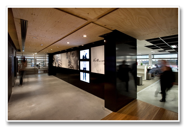
Leo Burnett Offices Australia | Office Design

Filed under: Interiors — Tags: , , , — Sahar @ 6:00 pm

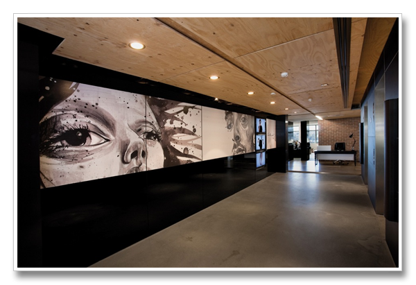
Leo Burnett, the advertising agency behind Marlboro man , Pillsburry doughboy, and  Green Giant, commissioned Hassel, a design company in Australia to come up with their Sydney office design. The “unfinished” look is the main part of their concept.

(more…)

« Newer PostsOlder Posts »

Powered by WordPress

Pin It on Pinterest