Design & Lifestyle Blog

12 Oct ’11

An Architect Designs His house Using Hi Macs Acrylic Stone

himacs06


For the past couple of decades, designers have been going for products that are more flexible in incorporating their designs, yet with durable finishes and a variety of colors. Thus the popularity of non-porous acrylic based surface materials such as Corian and Hi Macs are being used almost everywhere. In the project architect Karl Dreer incorporated the HI MACS® for his own private house. “HI-MACS® provides the opportunity of creating nearly any design in nearly any building — regardless of unusual weathering conditions, high degrees of moisture or enormous loads. It exceeds the standard material limits.”

himacs01

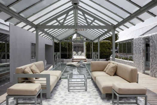
Window frames made out of HI-MACS® Arctic White, the grey pedestals are made from the material.

himacs09

A fitness and wellness area and family office are located on the upper floor of the left cube. A shower, wash basin, shelves and small seating options made from HI-MACS® are also included here. Temperature, lighting and shading of the house are controlled via BUS system — central, but individual. The operation and visualization of all details takes place via touch panels which are installed in every room. This HI-MACS® house exists without fossil fuels and sets standards for environmental protection and efficiency. Finishing touches like self-designed garden furniture made completely from HI-MACS® complete this story.

himacs08

himacs03

The dining room table is the central feature of the first floor and the link between the living room and dining area. The ability to thermoform HI-MACS® was critical in implementing the designed table.

In the kitchen all furniture including cabinet doors, worktop and sinks are made also from HI-MACS® with a special detail on the front milled cabinet doors.

himacs04

himacs07

himacs05

himacs11

himacs01


Hi-macs House, by Karl Dreer and Bembré Dellinger, photography by dirk wilhelmy

project: private house, ammersee, germany
period: 2010
design: karl dreer
fabrication: dreer gmbh – klöpfer surfaces, germany
project implementation: felix bembé & sebastian dellinger
material: hi-macs® arctic white, concrete grey
photographer: dirk wilhelmy

via: designapplause
2 Oct ’11

Black and White Hotel in Singapore | Hotel Design

The-Club-Luxury-Hotel-in-Singapore-3


The Club Hotel in Singapore is  a 22-room luxury boutique hotel where its design is based on patterns in black and white. There are no other colors, yet a fascinating way  of use of different shapes, oversized sculptures, and a magnificent balance within every space. 

Looking at the photos you can sense the purity, the beautiful designs with no reliance on color whatsoever, a blend of contemporary minimalism with antique elements to give it life. 

The-Club-Luxury-Hotel-in-Singapore-2

The-Club-Luxury-Hotel-in-Singapore-4


The-Club-Luxury-Hotel-in-Singapore-6


The-Club-Luxury-Hotel-in-Singapore-5


The-Club-Luxury-Hotel-in-Singapore-7


The-Club-Luxury-Hotel-in-Singapore-9

The-Club-Luxury-Hotel-in-Singapore-10

The-Club-Luxury-Hotel-in-Singapore-11

The-Club-Luxury-Hotel-in-Singapore-12

The-Club-Luxury-Hotel-in-Singapore-8

You can check more details on the hotel’s website.

Via  The Persuitist

27 Sep ’11

The Good Residence | Residential Design

good03

Known as “The Good House”, this minimal residence is located in Sandringham, Victoria, Australia designed by by Crone Partners. If I were to choose between an oversized residence and this one, I would definitely go for this simple yet architecturally powerful house. I for one appreciate the art of overlapping volumes, minimal use of materials and colors, and a lot of sunshine.


“Each “box” represents a distinct portion of the overall program. A sleeping / study zone, a living zone, a garage / workshop, and cantilevered above all of this, a parents retreat, complete with its own living area and secluded outdoor terrace.” Perfect….


good02

good01


good04

good06


good05


good09

good07

Daily Icon

16 Sep ’11

The Hollywood Hills Dream Home | Architecture

Hollywood-Hills-01

In a very exclusive area known to house properties for the rich and famous, lies this breathtaking residence. This 4,000 square foot property is located in the famous Hollywood hills and is worth almost $10,000,000. I actually think it is totally worth it. Not only does it overlook amazing views, the finishes, the furniture, and the landscaping is of the highest quality.

This residence has 4 bedrooms, five bathrooms, home theater, and a beautiful garden with an infinity pool overlooking a beautiful cityscape. Brands used were B&B Italia, Poliform (kitchen and cabinets), Gaggenau, Sub Zero, Crestron, Dornbracht faucets and Caesar stone countertops in the kitchen, Boffi accessories and fixtures, Antonio Lupi and Paola Lenti outdoor furnishings. Finishes include American Walnut floors, terrazzo, and Macassar Ebony.In addition to that, there are i-pod docks in all rooms, integrated CCTV, exterior speakers and the home theatre professional 3DLP HD projector. A beautiful art installation – “Sprout” by Nancy Braver – dominates the back yard landscape.

All extra information is listed on the property’s website. Check 9010 Hopen for more info.

Hollywood-Hills-03

Hollywood-Hills-04

Hollywood-Hills-07

Hollywood-Hills-21


(more…)

When Street Art And Food Meet | Restaurant Design

367092-Fairey_s_screen_printed_panels_fitted_together_wrap_the_restaurant_s_lounge_with_its_tweed_covered_chairs_Photography_Mark

In Miami, specifically Wynwood Walls Park, Tony Goldman offered the exterior of the buildings owned by Goldman Properties to international artists selected by New York gallery Deitch Projects. What was once just a warehouse, is now plastered inside out with street art of different styles and themes. Goldman’s daughter, Jessica, came up with the idea of turning one of the warehouses into a restaurant, Wynwood Kitchen & Bar. The restaurant finishes were mediocre, but the installations and transformation of the space was beautiful and well done. The restaurant is an attraction for hundreds of artists especially that Miami is popular for the Art Basel Miami Beach that takes place annually.

The difficulty in the transformation was not harming the murals specially when they were deciding where the location of the door and other major elements would be. When that happened, the artists would help out and incorporate the functional elements within the mural.

“Wynwood Walls will be getting six more murals before Art Basel 2011. But the park itself, which consists of a few re­purposed tractor tires, some blacktop, and some grass, will never get any fancy landscaping. "This is Wynwood," Samson says. "We’re not going to Disneyland it up." That means no birds-of-paradise and no palm trees.”


367090-On_the_patio_at_the_Wynwood_Kitchen_and_Bar_Ross_Lovegrove_s_tables_and_chairs_set_off_Shepard_Fairey_s_Wynwood_Walls_mural_in

367089-Ron_English_s_Hulk_Boy_includes_not_just_the_wall_but_also_a_rock_and_deer_figures_all_in_acrylic_and_spray_paint_Photography


367095-An_existing_spray_painted_mural_by_the_duo_Osgemeos_had_to_be_altered_to_make_room_for_front_doors_when_the_warehouse_was

367093-In_the_lounge_aluminum_cafe_chairs_face_another_mural_by_Fairey_Photography_Mark_Roskams_


367097-This_spray_painted_mural_is_by_Nunca_Photography_Mark_Roskams_

367096-An_aluminum_gate_marks_the_entry_Photography_Mark_Roskams_

367094-A_Ryan_McGinness_mural_in_acrylic_and_DayGlo_paint_is_blacklit_at_night_in_the_park_Photography_Mark_Roskams_

Designed by : James Samson


Interior Design Magazine

2 Sep ’11

El Palauet Living in Spain | Luxury Suites

PL1

No matter how well planned your vacation is, where you sleep could either ruin or take your experience to a whole new level. The people behind El Palauet Living  focused on a new trend, flats instead of the “last year” boutique hotels’ concept.  El Palauet Living is a group of flats that represent this new travel experience in Barcelona, Spain.

PL4


El Palauet Living consists of six suites constructed in a building dated back to 1906. Each suite is unique; no two are alike.

Since the building is over one hundred years old, there were many features that were kept and restored in the suites.  Features such as stained glass windows, distinctive ceilings (45 different ceilings to be exact),and hallway moldings were kept and combined with modern elements such as iconic trendy furniture by designers such as Eames, Saarinen, Van der Rohe and Starck, amongst others. Colors used were monochromatic emphasizing the beauty in the details of the historic finishes and focusing on the beautiful furniture.

Checking their website, you will notice how much El Palauet Living emphasize luxury and great service, hence they offer  guests a Personal Assistant to complete that sublime feeling of a holiday.

Check the photos below of their suites, spa, and outer terrace. You gotta love the luxury life!

PL5


PL6

PL7

PL8

PL10

PL11

PL12

PL14

1 Sep ’11

The Tastings Room | Restaurant Design

TR13

The Tastings Room is a new addition to the heart of Singapore’s Central Business District, Marina Square with the fine combination of French/Italian bistro cuisine and wine cellar under one roof. The restaurant’s vision was to refresh the perception of wine and food culture in Singapore by providing them at affordable prices. The overall spatial experience sandwiches the crafted black volumes between two layers of industrial aesthetics: exposed ceiling and concrete screed floor, to juxtapose/merge opposing aesthetics of being sophisticated yet affordable.


TR11

The programmatic composition was divided into three areas namely Wine, Bistro and shared spaces of Wine/Bistro.  A U-shaped band of these programs was deployed as it provided the most flexible layout with regards to shared functions, main circulation and points of entry/exit.  The Central Bar sits firmly in the middle to negotiate the needs of both Wine and Bistro, as well as providing the point of sale for this establishment.The total floor area of 137 square meters has been divided percentage-wise into 7% for the ruby red wine cellar; 47% for the Wine/Bistro area which also includes the private function rooms, the storage staff area and the central bar and circulation space. The remaining 46% of the Bistro includes seating space and the kitchen.


TR4


TR6

Drawing inspiration from the outer aesthetics of the dark wine bottle and antique weaved wine basket holders, the outer skin of these volumes adopt a series of black diagonal tiles while the interiors are inspired by the “hidden” flavors of wine, taking on singular hues for rooms such as the red wine cellar and yellow kitchen.


TR5


TR10


(more…)

30 Aug ’11

Tribal DDB Office By i29 | Offices

1


i29 interior architects designed these offices for the advertising agency Tribal DDB Amsterdam. The space is around 650m2 and accommodate 80 members of staff.

Tribal DDB Amsterdam is a highly ranked digital marketing agency and part of DDB international, worldwide one of the largest advertising offices. i29 interior architects have gained numerous awards and nominations over the years for their distinct work especially in commercial spaces and offices.

The main features in this project are the neutral colors of white and grey and more importantly the use of felt material to encase almost everything. The use of this material aids in sound absorption and in hiding up scars caused by demolition. “ There is probably no other material which can be used on floors, ceiling, walls and to create pieces of furniture and lampshades than felt. It’s also durable, acoustic, fireproof and environment friendly. Which doesn’t mean it was easy to make all of these items in one material!”


5

3

5

4


From the designers:

The goal was to create an environment where creative interaction is supported and to achieve as much workplaces as possible in the new structure with flexible offices and large open spaces.

i29 searched for solutions to various problems which could be addressed by one grand gesture. At first a material which could be an alternative to the ceiling system, but also to cover and integrate structural parts. Acoustics became a very important item, as the open spaces for stimulating creative interaction and optimal usage of space where required. This led us to the use of fabrics. It is perfect for absorbing sound and therefore it creates privacy in an open space. From felt we made ceiling, walls, furniture and lamps.

« Newer PostsOlder Posts »

Powered by WordPress

Pin It on Pinterest