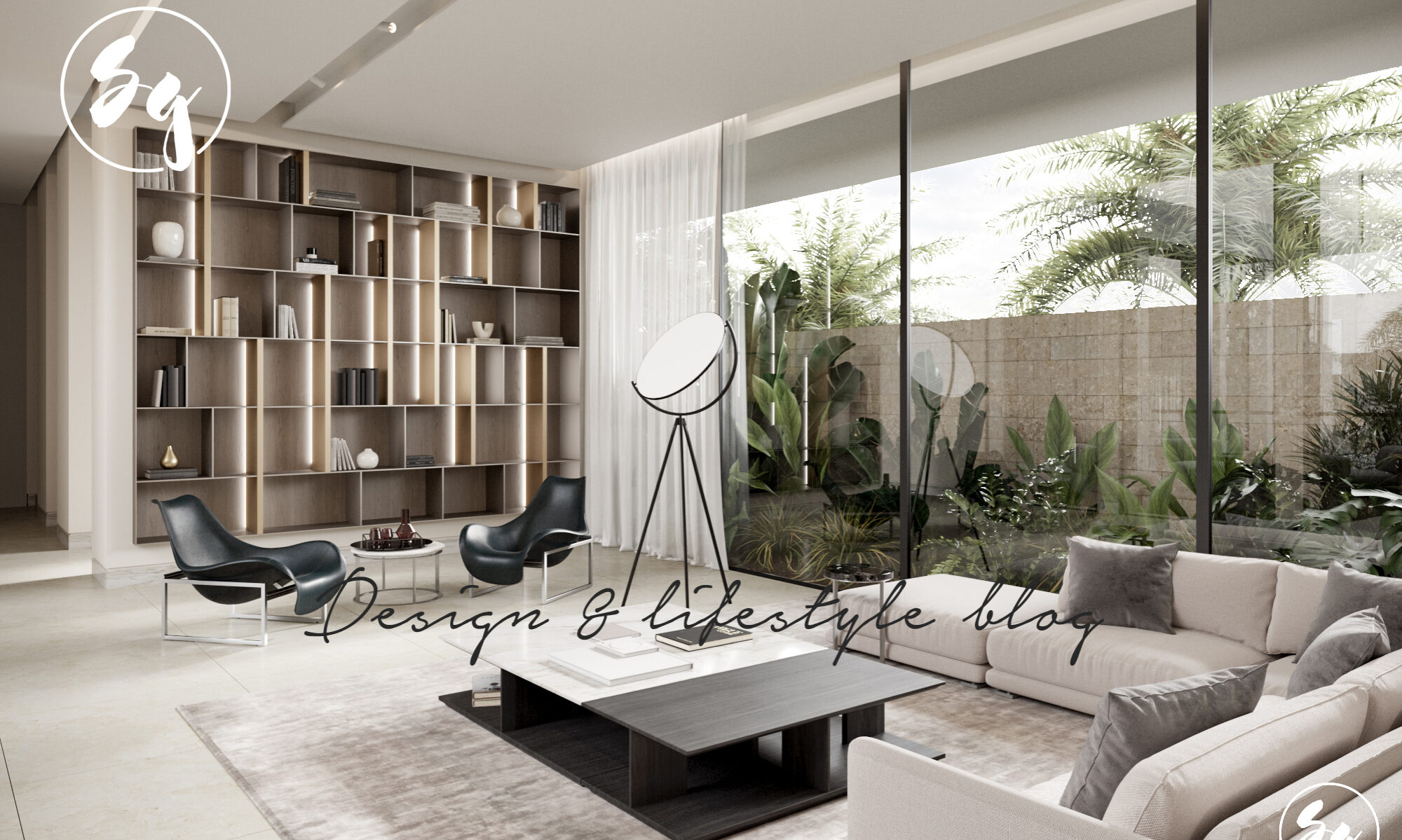
This year Pantone chose a neutral yet fresh color which symbolizes rebirth. I have been watching closely the predictions for the trends in 2017 and for the first time most brands and developers agree on one thing, NATURE. I have seen another hue of green as a trend prediction for 2017, and I was not surprised that Pantone chose green as well.
Among other trends are Terracotta and cork, two natural materials as well. Let’s see the upcoming exhibitions and see if this is how the major brands will go.
On Pantone’s website, you can see the palettes they chose to show how Greenery can be used in different ways for different purposes and effects. Personally I would use this specific green with white or light grey to keep the ‘zestiness’ of the color. I would love to use it with blue as well.


