Design & Lifestyle Blog

12 Sep ’10

Mont Blanc releases John Lennon special edition

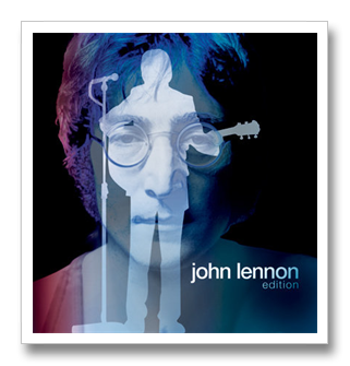
Today Montblanc unveiled their latest fountain pen—a  guitar neck clipped designed pen to honor John Lennon’s would-have-been 70th birthday.

This Donation Pen pays tribute to the legends of music and provides real help to young musicians by donating part of the pen’s proceeds to projects that support contemporary arts and music.


“To celebrate this edition, Montblanc will be hosting five simultaneous events in major cities around the world.The spectacular New York City launch event hosted by Susan Sarandon and Lutz Bethge, CEO Montblanc International will take place in a location overlooking Central Park, only a few blocks away from where the legend lived in his final years.
Throughout Sunday, September 12th Tokyo, Hong Kong, Berlin and Mexico City will be doing their part to bring to life John’s vision of bringing the world together. Of special note is the launch event to be held in Berlin – for it will be honored with the presence of Yoko Ono, who will be sending a special message of peace to the world in honor of the launch.”

Price for BP pen: $700 and FP pen: $920 prices go higher as gold and diamonds are added to the designs.

Update: Today , September 13,2010, Mont Blanc released the official stories behind their marvelous John Lennon pen collection with more photos of the various designs.

John-Lennon-Montblanc-pen-490

The story of John Lennon for Mont Blanc is found in these 2 links: link 1  link 2

11 Sep ’10

Kelly Hoppen: Home with Style

Kelly Hoppen is one of the world’s most renowned interior designers. Her style is unique, elegant, minimal yet very comfortable and homey. Her work has been an inspiration to me ever since I started my work as an interior architect. The colors and design elements she uses are timeless. Her creativity allowed her to launch her own furniture and accessory line to enable her to create the vision she has for each space. This usually is a dilemma for many designers, not finding the suitable elements to create the final look they want to achieve. She, however, has solved this.  Her business Kelly Hoppen Interiors had a turnover of 18 million pounds last year. In addition to the retail part of her business, she runs the Kelly Hoppen Design school .

mirrored vase

Mirrored Vase- Kelly Hoppen Collection

This October(2010) she will be launching her new vintage line in Hong Kong, photos and information taken from Yoo. Yoo is a new vision to creating luxury property in collaboration with world top designers such as Philippe Starck, Marcel Wanders, and Kelly Hoppen.

58711_431537876043_143161121043_5604273_3046135_n

October 2010 colection- Kelly Hoppen

58711_431537871043_143161121043_5604272_5076249_n

October 2010 collection- Kelly Hoppen

61577_431537826043_143161121043_5604271_2164171_n

October 2010 collection- Kelly Hoppen

hc oct2010

October 2010 collection- Kelly Hoppen

chepstow

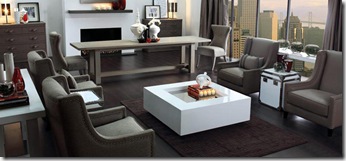
Apartment designed by Kelly Hoppen

(more…)

Latest Color Trends

Every season Pantone introduces the top 10 colors. All designers and consumers alike await this event as it will be prevalent around us for at least 6 months.Once a year however, there will be an announcement for the color of the year. The color of the year 2010 is Turquoise which explains why it is found in all seasonal palettes for 2010 in slightly varied hues.

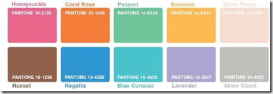
As most fashion enthusiasts know, New York Fashion week started September 9,2010 and staying till September 16,2010. During this event Pantone released their Spring 2011 Fashion color report.

The Spring 2011 Pantone Fashion Color Report shows that Africa, India, Peru and Turkey are acting as inspirations for spring 2011.
“The colors designers have chosen for the spring season present an interesting marriage of unexpected warm and cool tones,” said Leatrice Eiseman, executive director of the Pantone Color Institute.

spring 2011

Spring 2011 Trends

The designers who worked on the selection took into consideration the economic situation and aimed at using colors that can be extended from season to season. So you will notice that you can add to your closet instead of create an entire new wardrobe.

Below are the colors for fall 2010, full reports and pamphlets are found on the original site.

fall10

Fall 2010 Trends

TheMustHaveColorTrendsForFall2010

Fall 2010 Must have color trends

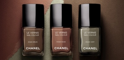
Chanel Limited editions- Khakis with a twist

(more…)

9 Sep ’10

Creating your Space: First step

As an interior designer and a former advisor at Jackson Contracting, Inc, I keep getting questions and inquiries for tips to improve a space, especially from people around me or who I visit for the first time. In many cases it puts me in an awkward position, they would be asking me about their curtain fabric, while their issues are at a much larger scale. Their curtain would be the least of their problems.

People should understand the designing your space is not just choosing nice furniture or fabric, its working on the vibe of the area. if you have issues in your life it will reflect in the space you live or work in and vice versa, its just how the universe works. From personal experience as well as experience with my clients, you are the one who creates the energy around you.

When I speak about energy, some people give me the look, “yeah just tell me if the colors match”, but energy is in everything around us whether we like it or not. To simplify, “sound” is energy, we all learned that in physics at school, yet we don’t see it. That’s how everything else affects us.

What the Chinese have known for thousands of years, has only reached the Western World recently. The study of the effect energy has on our behavior and surroundings and the other way around. This study is known as Feng Shui. Feng Shui is no secret anymore, although 12 years ago when I first came across a Feng Shui book and read it, it was considered something very new and difficult to comprehend or explain. But through daily practices and numerous readings, I found that Feng Shui is actually more common sense than a complex study.

Clutter

The first rule of applying any update to your space is starting with clutter clearance. What is clutter? Clutter is piled stuff you haven’t used in a long time, it is piles of paper on your desk, it’s old shoes that don’t fit anymore in your closet, its clothes you haven’t worn in  years, its old Christmas cards that fill up boxes and boxes, its a broken 1984 stereo that you will never use again, its old cassettes and vinyl record you will never listen to again, its stuff you think your children will appreciate when you leave for them in your inheritance , and the list goes on… No matter how you try to enhance your living area or office you will never feel the change unless you get rid of that clutter and deal with the actual issues behind holding on to them. I don’t want to sound as a “preacher”, but trust me, my mom will read this and laugh remembering our endless fights to clean my room and get rid of my piled up unwanted “stuff”. 10 years ago I read a book called “ Clear your Clutter with Feng Shui” by Karen Kingston and which changed my life. Personally I like all that’s eccentric and “out of the box”, its why I was interested in Feng Shui when almost no one I knew had heard of it. I bought magazines and books and applied as much as I could from them.

For anyone aiming at change in his/her life I recommend that book.It is the first step to refresh your life and aim at new beginnings. It did that for me. After reading it, piles of unwanted clothes, magazines, bills, meaningless sketches, were all taken out of my room (I was still living at my parents’ at the time). Instantly I felt everything around me fall into place. Just like a breath of fresh air. It was amazing.

Who Clutters?

According to Kingston, who is specialized in teaching the art of “space clearing”, the person who has clutter is mainly someone who keeps things “just in case”, others have identity issues and hold on to things they identify with and feel secure around such as gifts, many hold on to items as “memories”, all of which negatively influence us and keep us from moving on. It is difficult getting rid of clutter, but once you begin and see results you will be amazed at the results, this works every time. Try it with one small room and feel the difference in  at least a certain area of your life. Here comes the idea of how clutter in certain areas of your space affects specific zones of your life.

The Bagua

The Bagua is simply a diagram used in Feng Shui to correspond to the different aspects of your life in relation with an area of your personal space. You see, the name is complex, but the application is so easy it becomes second nature. below is a a very simple Bagua I got from Feng Shui for Real Life. Its a rectangle divided into 9 squares, each square corresponds to an area in your house, or room. You can use it for the entire apartment or for one single room at a time.

The first thing you have to do is sketch the outer line of your apartment or room, divide the space in 9 equal parts, you might have missing areas , its ok, and that’s how you know what each area corresponds to. That’s how you can start knowing where your problem areas are. For example, if you are having money problems, you might find there is something wrong with the room which is at the top left part of your apartment, the problems could be clutter, broken mirror, burnt out lights etc.. Always place the bottom part of your diagram aligned with entrance of your space.
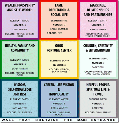
simplified-bagua-map

(more…)

6 Sep ’10

The 10 Best of … Pens

“I write entirely to find out what I’m thinking, what I’m looking at, what I see and what it means. What I want and what I fear.”

Joan Didion  (American Journalist and Novelist, b.1934)

No Matter how much we rely on our computers, IPads, mobiles etc.. there is a certain charm for handwritten notes and articles. Among my favorite accessories are pens. I can never write with an ugly pen or use one that deforms my handwriting, this is a sensitive subject to me. And as a designer, I use my pens to sketch and communicate my ideas and designs. This is why it is important to me.

I have compiled a series of photos for some of the best designed pens that are also from well known companies. The first brand, which happens to be my favorite as well, is MontBlanc.

Montblanc is well known for its limited editions. Pen collectors and admirers look forward to their upcoming tribute whether for a writer, a patron of art, or a theme, and Montblanc have truly mastered it. In 2010, according to Pen World, the readers’ choice award for “best tribute” was for Mont Blanc’s “tribute to Thomas Jefferson” pen.

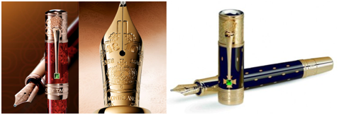
Among their vast collection lies the   limited edition  Mahatma Gandhi  pen launched specifically for the 140th anniversary of his birth. This has to be my favorite. The details and design are just amazing.

Montblanc- Tribute to Gandhi 140yrs

The latest addition to the Patron of Art tribute, Montblanc launched recently The Elizabeth I Limited edition.

The Elizabeth I Limited Edition 888 is a 750 solid gold fountain pen featuring a barrel and cap in precious lacquer.

Hand engraved on its 18 K gold nib is a bejeweled gold crown in which Elizabeth I ascended the throne in 1559.

Topping the cap is the Montblanc emblem rendered in shimmering mother-of-pearl.

The clip descends from a solid gold Tudor Rose while its embellishment, a princess cut green garnet reflects the bejeweled crown.

Montblanc- Tribute to Elizabeth I

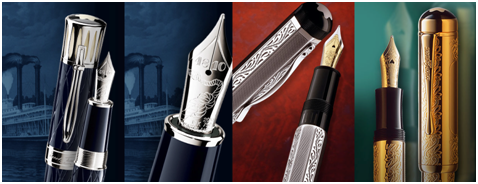
Other amazing designs are the Mark Twain pen, The Lorenzo De Medici, and The Louis XIV shown below.

Mont Blanc- Tribute to Mark Twain, Lorenzo De Medici, Louis XIV

(more…)

4 Sep ’10

Skylines and Icons: The Controversy

Filed under: Architecture — Tags: , , , , , , — Sahar @ 12:42 am

Almost every city has its icon building or skyscraper making it the symbol of the city if not the entire country. Kuwait has its “Kuwait Towers” but now this might change, a new iconic tower is emerging. Like everything so big, controversy arises, many people are against it due to the high cost and its “alien” character in a city where no proper city planning has been done, others however are thrilled to have such a monument that would draw international attention. The AlHamra tower is 412m high, one of the 10 highest towers in the world, however this is not the main special characteristic of this tower, its pride resides in it being the tallest “sculpted” tower. It is about time we appreciate design and form over just height. This tower captures it all.

Its southern wall acts as the backbone of the skyscraper, yet it is designed to decrease solar radiation. In a country as hot as Kuwait, creating such an aspect that protects the building against harsh environmental conditions is essential.

It’s a pity how the area around it is very primitive with old 1 and 2 story structures that are an eyesore for everyone passing through the city. In addition to the unfortunate surrounding, the angle at which the tower is situated does not allow much ability for passers by to view the entire monument, it can only be seen fully from a distant angle.

Instead of criticizing the AlHamra tower for being among these buildings, instead, I think its a step to find a solution for everything that should NOT be there.

Below are images taken from AlHamra website, the video from Discovery’s “Build it Bigger” , and the last one from my phone’s camera couple of days ago to show the tower’s recent status.

For details, floor plans, and images please refer to the tower’s web site.

sculptural maquette of tower

Kuwait’s New Skyline

Stage of completion of Al Hamra Tower now

(more…)

3 Sep ’10

Maison & Objet 2010: 10 years 10 designers

It’s that time of the year again, tomorrow Maison & Objet 2010 officially kicks off in Paris, France. The exhibition featuring the best brands of furniture, home decoration, and accessories starts tomorrow September 3rd till September 7th,2010. This year for the exhibition’s 10th anniversary the featured designer is the well known Philippe Starck who is the creator of the year 2010, 10 years after his first nomination. The showcase will feature 10 talents for 10 different designers who will be the generation of the next 10 years.

A 5 minute video interview with Starck himself explains it all.

For those who are visiting, hope you enjoy it.

2 Sep ’10

Paintings: Tales from Lebanon

Filed under: Art & Photography — Tags: , , , , , — Sahar @ 1:00 am

Paintings are very personal; their addition to any space can transform its entire character. An interior designer feels the project is complete with these valuable additions especially if they reflect a character or tell a story. In our modern times, with the advance and appreciation of forms and colors, well established proportions are essential in every artwork, if not done properly, could cause an eyesore and mess up the entire feel of the space.

In this post I will be mentioning two young Lebanese artists I had the chance to see their work evolve in the past few years. Their work is abstract yet full of emotion and character.

Paula Chahine is an artist I know personally, her work is very inspiring. Her display of the human body and its movements in addition to the vibrant colors and beautiful lines has made her very popular among those who have an appreciation for the young spirited art. The selection below is among my favorites, as an added service she does custom-made paintings, “l’art sur mesure”, to accommodate a client’s color or theme preference while maintaining her own style.

(more…)

« Newer Posts

Powered by WordPress

Pin It on Pinterest